
Okay, so by now I'm sure that anyone who has read this blog is well aware of my all-consuming obsession with fashion, and if there are any doubts keep in mind that the word "addiction" appears in the blog's name. It's that serious. What you probably don't know is that I also have a borderline unhealthy obsession with fragrances. It's still pretty new, but like a weed it took no time at all to grow. Funny thing is it didn't start because I had a genuine interest in scent. It started as a result of searching for a new scent that was different from the few that I already own and have worn for years. I'm a full fledged junkie by this point, scamming samples out of any SA who will give them and hording them like food rations. I figure that as with any obsession, talking about it can only help. So that's exactly what I'm going to do. Stay tuned...
And in case you were wondering no, I still haven't found that one new fragrance to add to my collection.
Friday, September 3, 2010
Wednesday, July 21, 2010
Hate is a strong word...
But sometimes it's the only word that seems appropriate. When the first image from the new Gucci Fall Winter 2010 campaign hit the Fashion Spot, I was excited to see what it would look like. The collection itself left a good impression on me, so naturally I was hoping the campaign would do the same. Let's just say that my initial impression of it wasn't so good. But I was willing to hold off announcing my verdict until I saw more. Unfortunately seeing more didn't change my feelings at all, and I pretty much hate what I've seen of the campaign. Now frankly, I don't think that Mert & Marcus' style suits Gucci. Their work is always recognizable for it's hyper-fection (I know that's not a word, but give it time), and I think that their super exaggerated look has it's place in fashion, Gucci just isn't it. But these photos go beyond exaggeration; they're downright cartoony looking. Seriously, I look at them and I see a digital illustration, not a photograph. I'm assuming that's the point, but I honestly cannot stand the way it looks. The plastic Barbie and Ken doll quality is just extremely unappealing. It's also kind of odd considering that most of Gucci's appeal is based on the suggestion of sex. As far as I'm aware there isn't anything sexy about a Barbie doll. The poses are unappealing as well, and despite what seems like a lot of effort on Raquel's part, I don't see anything "fierce" about them. To me they just look ridiculous and far too modely. Back in the day you never would have seen a Gucci girl hamming it up like some contestant on America's Next Top Model, trying to out-pose the competition. She was far too cool for that. Apparently that's not the case anymore, and that also goes back to Mert & Marcus. Love 'em or hate 'em those poses are very much a part of Mert & Marcus' ouvre. Something about the color palette is bothering me too. Rather than enhancing the warm tones of the clothes, the goldness of the sand is just sort of washing everything out. It's just one big blur of different shades of beige paired with a shade of blue that's better suited to the ocean thanthe sky. Color wise I think the shots with black clothing are marginally better, although that's not saying much. But I think I might be able to look past the aesthetics if these ads had anything at all to do with the look and the message that both the men's and women's collection delivered. Both collections were slick, sharp and very polished looking, they wouldn't be out of place on the streets of any metropolis or in a dimly lit nook at the chicest of nightspots. However, the clothes do look completely out of place in a desert. I mean, I don't demand utter realism from my fashion ads, but the sight of a fur coat or velvet hiphuggers in a desert with the blazing sun glaring off of every surface is a little too ridiculous.


Oddly enough this isn't the first time a Gucci campaign has taken place in a desert. It's happened at least twice before that I can recall, and one of those campaigns, Fall Winter 2000 by Alexei Hay, seems to have inspired this one. There was even a shot of a model in a fur coat reclining on a desert rock (for the record I believe all of the backgrounds used in that campaign were fake/digital). I actually happen to like that old campaign quite a bit. I've been trying to figure out why I like that one and dislike this one, and I suppose it boils down to two things; while the backgrounds in that F/W 2000 campaign look intentionally fake the models themselves don't, and the incongruity of the backgrounds (there were also shots that took place in front of a freeway overpass and on a stormy beach) seemed intentionally weird, whereas this background in the Moroccan desert probably wasn't meant to be as incongruous as it is. Those ads didn't make sense, and I get the feeling they weren't supposed to. They were just supposed to be beautiful, unusual images, and that's exactly what they are. I don't think this new campaign has either of those qualities going for it. More than anything I'm just disappointed that this collection, easily Giannini's best and probably just a fluke, wasn't better represented in print. It deserved to be.


Oddly enough this isn't the first time a Gucci campaign has taken place in a desert. It's happened at least twice before that I can recall, and one of those campaigns, Fall Winter 2000 by Alexei Hay, seems to have inspired this one. There was even a shot of a model in a fur coat reclining on a desert rock (for the record I believe all of the backgrounds used in that campaign were fake/digital). I actually happen to like that old campaign quite a bit. I've been trying to figure out why I like that one and dislike this one, and I suppose it boils down to two things; while the backgrounds in that F/W 2000 campaign look intentionally fake the models themselves don't, and the incongruity of the backgrounds (there were also shots that took place in front of a freeway overpass and on a stormy beach) seemed intentionally weird, whereas this background in the Moroccan desert probably wasn't meant to be as incongruous as it is. Those ads didn't make sense, and I get the feeling they weren't supposed to. They were just supposed to be beautiful, unusual images, and that's exactly what they are. I don't think this new campaign has either of those qualities going for it. More than anything I'm just disappointed that this collection, easily Giannini's best and probably just a fluke, wasn't better represented in print. It deserved to be.
images from oystermag.com, stylelist.com and twitter/rushes via ThiagoMello at tFS
Thursday, July 8, 2010
Paris, Je ne t'aime...
Jean Paul Gaultier
You know it's like clockwork, twice a year at six month intervals I'm reminded of just how much I used to love Gaultier. I wish I still did but I just don't anymore. In fact there are times, like last season, where I don't even like Gaultier's haute couture. I've wondered if maybe I've changed, that I've seen more of fashion than I had when I first became aware of Gaultier's work, or that my taste has simply evolved, or maybe even that I just idealize his past collections. But then I've looked at those older collections, the ones that left an impression, the ones I loved then and still love now, and it's plain to me that it isn't me that's changed, it's Gaultier.
As for what has changed about his work, that's not as easy to pinpoint as it is with, say, Galliano's work at Dior. The general impression I'm left with is that these days there isn't much subtlety in Gaultier's work any more. It's a given that he's always liked to play with wit, subversion and kitsch, but these days it seems like those elements are the dominant ones, whereas in the past his couture collections were a wonderful mix of wit, intentional bad taste, faultless French chic and old school glamour with whatever his seasonal inspiration happened to be. Comparing his older work to his newer work is like comparing wry humor to slapstick. The former uses intelligence to make you laugh, the latter uses silliness. To me this season's collection highlights that difference between Gaultier's past and present extremely well. The collection was inspired by Paris via Yves Saint Laurent's infamous 40s collection of 1971. That collection, if not the most famous collection of Saint Laurent's 40 year career, is certainly one of the most famous. It's been extensively referenced by many, many contemporary designers over the years. The look of that collection is instantly recognizable; turban, red lips, a fox fur chubbie or stole, ruched jersey dress, stockings and heels. Once you know the formula you can see exactly where Gaultier found his inspiration this season, from the exaggerated knotted turbans (or hair styled to look like turbans), to the exaggerated rounded shoulders on coats and jackets, and the fishnet stockings with exaggerated Cuban heels that were actually a photo print of the Eiffel Tower. Notice I'm using the word exaggerated to describe everything. That was the overall effect; too much. Considering that the original Saint Laurent look is pretty exaggerated to begin with, Gaultier's riffs seemed more like caricatures than anything else. Paris isn't a new inspiration for Gaultier, in fact it's where he always seems to wind up even when his inspiration comes from somewhere else. That innate Frenchness is why so many people regard him as this generation's Saint Laurent. So it was disappointing to see him channeling that inspiration in such a cartoony, almost childish way this time around.


That lack of subtlety is really what bothers me about Gaultier these days. He just sort of whacks you over the head with how "witty", "ironic" or "chic" each look is, instead of letting you decide on your own whether they are or not. Even the shout outs to Saint Laurent, which have always been present in Gaultier's couture collections, are done in such a loud, obnoxious, tactless kind of way. I think it's safe to say that most people who are attending a Gaultier Haute Couture collection, whether as a client, critic, or editor would be able to recognize even the most subtle or subversive nod to YSL, so I really don't understand why Gaultier needed to scream them through a loudspeaker as if he were speaking to the hearing impared. And to me it's not just the styling or the presentations that have changed. I just don't think the clothes have the same magic that they used to, not for me anyway. Of course they're beautifully made, and of course his clients will buy them, but it's been a while since he sent something down a runway that took my breath away or made me do a double take. Even his extravagant show pieces don't do anything for me anymore, because they're usually so far over the top that they could make some of Galliano's mile-wide ballgowns seem almost subtle by comparison. I don't know, maybe this is the real Gaultier and all of those collections where he created sophisticated, sexy, chic, subversive clothes that were presented in an equally sophisticated, sexy, chic, subversive way were just the result of Gaultier holding back. If that's the case then I personally wouldn't mind seeing him shackle his more outlandish impulses.
Take a look at some of his older collections and see if you feel the same way.
Spring Summer 2001
Spring Summer 2002
Fall Winter 2002
Fall Winter 2003
Spring Summer 2004
all images from Style.com
Tuesday, July 6, 2010
Memento mori...
Givenchy
I must admit that when it was announced a couple of weeks ago that Riccardo Tisci made the decision to scale back his Haute Couture collections for Givenchy, nixing a runway presentation and cutting the total amount of looks shown to the press down to 10, I wasn't thrilled. I could see the logic in his choice, because taking a still photograph of a garment up close is the next best thing to seeing it in person (which is what press and clients would be able to do). But I tend to prefer some kind of runway like setting, whether it's a traditional up-and-down runway or something more complex in the vein of old school Galliano. It's not even that I find a static salon presentation boring, it's that it's really hard to give context to a collection when you're simply photographing it in front of a wall. With music, lighting and set design you can create some kind of ambiance that complements the clothes. It also allows a designer to bring the audience into a world of their creation, to give the audience a more multi-dimensional look at what was going through their heads when they designed the collection. I also wasn't thrilled about the fact that last season's clunky, and honestly borderline ugly collection would be the last impression of a Givenchy couture show, until further notice at least. But I'm enough of a Tisci fan to have faith that he would deliver something special now that the focus would be entirely on an extremely limited number of clothes. On that count I don't think I was wrong.


Anyone who has been following Tisci's career at Givenchy can view the 10 looks he presented and see things that are similar to work he's already done. For the first time though I don't see that as a negative thing. My rule for designers is that if they're going to revisit something they've already done or rework a piece from their past they had better improve upon the original. In my opinion it's rare that that actually happens. I can't speak for everyone, much as I might like to, but I think that this time around Tisci actually did manage to take those old ideas and make them better. Each one of his ten looks had something familiar about them, from religious motifs to heavy beadwork, geometric cuts to intricate embroideries and appliques. But even at their most baroque, as in a narrow column dress completely encrusted in gold sequins and beads, the clothes didn't seem as labored as they sometimes have in the past. They were detailed to nth degree, no doubt about it, but I really don't think any of the clothes felt overwrought. Tisci's use of his inspiration felt completely under control as well. Even something like lace applique in the form of the human skeleton doesn't seem as gimmicky as it could have been. In fact, I think there's something really beautiful in that blend of purity and darkness, beauty and physical decay. You could also make the connection between the reminders of mortality as seen in the porcelain skulls that apparently adorn some of the white jackets and the seemingly imminent death of Haute Couture.
So yeah, I'm not entirely in love with this scaling back thing. At the very least I would have like to see a larger collection. But then I stop and think to myself that if scaling back was what it took for Tisci to make clothes that are this beautiful and this focused, then I really shouldn't have anything to be upset about, should I? If it wasn't for how small the collection was, I might go so far as to call this Tisci's best couture collection yet.
Unfortunately there's some copyright issue going on with the images Conde Nast is using at the moment, so you'll have to go to Style.com yourself to check out better quality images and rear views of each look. I'd recommend viewing them in full screen mode.
all images from WWD.com
Monday, July 5, 2010
In the golden afternoon...
Christian Dior
I was absolutely not planning on having anything to say about the Dior F/W 2010 Haute Couture collection. That's pretty much why I stopped reviewing Dior shows, because I've had nothing to say about them except the same-old same-old; boring, stodgy, out of touch, beneath Galliano's capability. It gets tiring complaining about the same thing. But as it turns out I have something to say this season.
I don't hate it, not at all. In fact, there are things about it I quite like. For starters I like that Galliano took what is an extremely cheesy inspiration (flowers) that could easily have resulted in an equally cheesy collection of fusty Dior rehashes, and threw a bit of a curve ball. The clothes are flowery all right, but any flowers that inspired these clothes were probably seen on one of those neon black light posters with black flocked background, not in a garden. I honestly think that the black light poster comparison is kind of apt, because there is something delightfully tacky and kind of vulgar about this collection. Whereas a lot of Galliano's recent collections, both couture and ready to wear, have seemed like earnest attempts at doing tasteful, elegant clothing, this doesn't seem to be going for that effect at all. It seems like it was meant to be over the top and a little ridiculous. Why else would the model's heads be wrapped in colored cellophane like a floral bouquet? That little styling trick, coupled with the technicolor makeup and cartoony pompadours, was a nice touch that helped keep the collection from feeling stodgy. Same goes for the raffia craft ribbon tied around the waists of jackets and dresses. Overall there was something a little haphazard about things. This collection doesn't seem like it was the result of John and his team studiously poring over the Dior archives and painstakingly trying to recreate their beauty. Instead it looks like it came from the inside. It also looks like it was somewhat fun to create. The clothes may be tacky, or silly, or completely ridiculous, and they may not have that madcap spirit of old, but you can't deny that they have a certain liveliness to them that has been all but missing from the house recently. For me, that's the most exciting aspect of this collection. There's more passion in these 30 dresses than there has been in all the collections of the last two years combined. It also doesn't hurt that all I can think about while looking at this collection are those bitchy singing flowers from Alice in Wonderland.


Don't get me wrong though, this is still a far cry from what Galliano is capable of creating. As pretty as the colors and details may be, the fact is that these clothes are still not particularly contemporary. And I can't help but feel like it's kind of easy to look at flowers as a source of inspiration and just end up creating dresses that are meant to look like flowers. It doesn't take the strongest imagination to put hand painted petals cascading down the side of a dress. But on the plus side the clothes don't look like something Dior himself would ever have designed, so that's a bit of progress right there. Another positive is that for once the bright, borderline garish color palette makes utter sense given the theme of the collection, not to mention that some of the clashes are really quite beautiful and very well done. Even though this collection doesn't exactly erase the memory of the last few years it doesn't leave me wishing I hadn't bothered to look at it, either. That may not sound like much, but believe me, at this point that's high praise for a Dior collection.
all images from Style.com
Thursday, July 1, 2010
Color me shocked...
If I said that I've hated the ad campaigns Mario Testino has shot for Versace since 2005 it wouldn't be entirely true. Hatred is a feeling, and unless you want to count apathy I haven't felt a thing about any of them. My first experiences with Testino's work were his Gucci campaigns, and whether or not you liked those they were neither bland or predictable. When he took over from Meisel as Donatella's lensman of choice, I suddenly realized that I probably liked Testino only when Tom Ford and Carine Roitfeld were calling the shots. His American Vogue covers and editorials, ranging from pretty but banal to just plain banal, did nothing to convince me that I was judging too harshly. Now I don't want to make it sound like I always loved Meisel's work for Versace, because that's not the case. But even at their least interesting I can't remember any of his campaigns being mind-numbingly bland. Hell, even if they were the fact that I don't remember them that way should mean something, right?
But for some reason Testino's campaigns have always had this aura of lifelessness about them, and while that would be undesirable for most labels, it's downright sacrilegious for a label like Versace. Suck all the fun, sexiness and glamour out of Versace and there really isn't much left, is there? Needless to say Versace isn't one of the campaigns I look forward to seeing anymore. But still, curiosity got the better of me and I took a look at the campaign on the Fashion Spot and my jaw promptly hit the keyboard. It looks absolutely nothing like the work Testino has done for the house in the past five years.


I may just love it, though it's still too soon to tell. By Testino standards this campaign is almost edgy, and edge is something that Versace has been struggling to regain lately. There's something slightly gritty about the photos that compliments the mens and womens collections perfectly, and even though I wouldn't normally consider Versace gritty, the photographs are doing a pretty good job of making me reconsider. Quite frankly I wouldn't have thought Testino would be the photographer to make me reconsider that. Even at his best his work isn't exactly known for it's grit. This not only feels fresh for Versace, but very much of the moment. Lord knows I've bitched and moaned more than once when a designer or photographer falls into predictability, so to say that I'm thrilled about Testino doing something completely out of the box is kind of an understatement. And Kudos to Donatella and her team for knowing when to shake things up. I'm not at all surprised by the mixed response the campaign is getting so far; people don't like change, and neither Kate Moss or Gisele are in this campaign. But in fashion change isn't just inevitable, it's essential. So if this is a hint of the direction Donatella is going with the brand, I say bring it on.
all images from versace.com via tarsha at theFashionSpot
Turn the page...
Alexander McQueen
Sometimes I kind of get the feeling that when a new designer is chosen to replace someone there's almost a desire for that new designer to fail, and a need to pick out their every flaw. My guess is it's a resistance towards change. I completely understand that, even if I've only ever experienced that once. But I think it's safe to say that Sarah Burton, the woman chosen from within the company to take the reigns after Alexander McQueen's death this past winter, has garnered quite the opposite response. When the news broke that she would take over as Creative Director of Alexander McQueen, people seemed positive about the decision. It's as though people don't just want her to succeed, but need her to. Let's face it, there is no one who can truly replace McQueen, but with his untimely passing leaving a gaping hole within the ranks of international fashion designers I get the feeling that people just want to see his name live on. That's where Burton comes in. Honestly I think that the position she's in seems more daunting than having a public hoping you'll fail. If expectations start out high and you don't meet them, it's all the more disappointing for everyone who was rooting for you. I wasn't going to judge Burton based on her first menswear outing shown earlier this month, and even now with the debut of the very first women's collection overseen by her for Resort 2011, I'm still not ready to completely judge whether or not she can shoulder McQueen's immense legacy. Ultimately her collection for Spring Summer 2011 will be the moment to judge her on. But I will say this, the collection of clothes that she showed is, in my not so humble opinion, a very promising start to a new chapter in the history of McQueen.


I guess nobody should be surprised by how "McQueen" this collection is. After all, Burton was his right hand for many years. Without being told that these photos are of a McQueen collection, I would have absolutely no doubt that they are. But this doesn't look like a case of one designer trying to emulate their predecessor, and it's not some caricatured version of "Alexander McQueen". Instead this looks like the work of somebody who was so in tune with the person she took over from that the change is seamless. You can see traces of something new in the hints of softness and the less aggressive spirit, but those hints of something different seem completely natural. There's nothing jarring about them at all. My biggest concern when is was announced that the label would survive beyond it's namesake was that the person chosen to replace McQueen would try too hard to follow in his footsteps and would end up designing on auto-pilot as a result. As much as seeing clothes that could have been designed by McQueen himself might appease some people, to me there would be something kind of soulless about simply trying to replicate another designer's personality. I doubt if anyone could question Burton's understanding of the McQueen DNA, after all she contributed to it, but I'm happy to know that she seems to have her own voice as well. It also doesn't hurt that she seems entirely capable of creating breathtaking clothes without the leadership of McQueen himself. I'll still wait to see her runway debut in the fall to decide whether or not she is the true heir to McQueen, but for now it seems like the label is in very capable hands.


I guess nobody should be surprised by how "McQueen" this collection is. After all, Burton was his right hand for many years. Without being told that these photos are of a McQueen collection, I would have absolutely no doubt that they are. But this doesn't look like a case of one designer trying to emulate their predecessor, and it's not some caricatured version of "Alexander McQueen". Instead this looks like the work of somebody who was so in tune with the person she took over from that the change is seamless. You can see traces of something new in the hints of softness and the less aggressive spirit, but those hints of something different seem completely natural. There's nothing jarring about them at all. My biggest concern when is was announced that the label would survive beyond it's namesake was that the person chosen to replace McQueen would try too hard to follow in his footsteps and would end up designing on auto-pilot as a result. As much as seeing clothes that could have been designed by McQueen himself might appease some people, to me there would be something kind of soulless about simply trying to replicate another designer's personality. I doubt if anyone could question Burton's understanding of the McQueen DNA, after all she contributed to it, but I'm happy to know that she seems to have her own voice as well. It also doesn't hurt that she seems entirely capable of creating breathtaking clothes without the leadership of McQueen himself. I'll still wait to see her runway debut in the fall to decide whether or not she is the true heir to McQueen, but for now it seems like the label is in very capable hands.
Monday, June 28, 2010
Simply Irresistible?...
Each season the Lanvin campaign is highly anticipated, mostly because there's no telling what it will look like. Most of the time that anticipation pays off, with Alber Elbaz and Steven Meisel delivering unusual, striking campaigns that perfectly suit the collection they're selling. While I can't go so far as to say that the Fall Winter 2010 ads have completely failed at their mission, I have no reservations in admitting that I don't think they're the best they could have been, not even close. The weird thing is that, despite how below par I feel they are, they're still pretty dynamic looking. Mostly though I just don't think the spirit of the collection, with it's almost animalic rawness and an unmistakable aggression, was translated into the photographs at all.


First off, I don't like the coloring or the lighting that Meisel and Elbaz settled on. With all of the rich shades of brown, hints of warm, deep jewel tones and tarnished metallics that made up much of the collection I was hoping for and expecting the campaign to have the same kind of warmth and sensuality. Instead the lighting is cold and harsh, which works in some situations, but I don't love it here. I don't particularly love the styling either. I have a soft spot for Patrick Nagel's work, but it's been over two years since designers, photographers and makeup artists began revisiting the 80s and started channeling his white skin/black eyes/red lips look. As dramatic a look as it is, if I have to see one more model made up like one of his portraits or one of the girls in a Robert Palmer video I might crack. But the thing that's bothering me most is that there's something about this campaign that doesn't feel very "Lanvin". dior_couture1245 at the Fashion Spot brought that up, and as I looked at the images more I really did start to agree with him. Part of Lanvin's image is the slight imperfection in the clothes, or styling, whatever, and when you remember that, these super-slick, super-produced images seem very distant from the actual product. For an idea of what I might have liked this campaign to feel like, look no further than Dolce & Gabbana's S/S 2005 ads. I'm not suggesting that's how this campaign should have looked necessarily, although some similarities wouldn't have hurt in the least, but that's most definitely the vibe I pictured for Lanvin this season.


First off, I don't like the coloring or the lighting that Meisel and Elbaz settled on. With all of the rich shades of brown, hints of warm, deep jewel tones and tarnished metallics that made up much of the collection I was hoping for and expecting the campaign to have the same kind of warmth and sensuality. Instead the lighting is cold and harsh, which works in some situations, but I don't love it here. I don't particularly love the styling either. I have a soft spot for Patrick Nagel's work, but it's been over two years since designers, photographers and makeup artists began revisiting the 80s and started channeling his white skin/black eyes/red lips look. As dramatic a look as it is, if I have to see one more model made up like one of his portraits or one of the girls in a Robert Palmer video I might crack. But the thing that's bothering me most is that there's something about this campaign that doesn't feel very "Lanvin". dior_couture1245 at the Fashion Spot brought that up, and as I looked at the images more I really did start to agree with him. Part of Lanvin's image is the slight imperfection in the clothes, or styling, whatever, and when you remember that, these super-slick, super-produced images seem very distant from the actual product. For an idea of what I might have liked this campaign to feel like, look no further than Dolce & Gabbana's S/S 2005 ads. I'm not suggesting that's how this campaign should have looked necessarily, although some similarities wouldn't have hurt in the least, but that's most definitely the vibe I pictured for Lanvin this season.
all images from WWD.com via Flashbang at tFS
Friday, June 25, 2010
Quoth the raven...
I never thought I'd see a day when Tom Ford would be channeling Edgar Allen Poe for inspiration, and despite his new role in the directors chair I never really pictured him having an Alfred Hitchcock moment either. But if his newest ad campaign is any indication, Tom has a side to him that we've never seen before. Sure, he's tapped into the darker side of things with his fashion, but his brand of darkness has never been of the melancholy, terror filled variety, so seeing these new photos featuring that foreboding symbol of death, the raven, is kind of surprising.
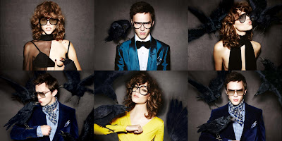
There are many things we have already seen and might expect to see in any ad campaign that Tom Ford touches; ravens just don't happen to be one of those things. Bare nipples, however, are. But as predictable as a bare breast might be for a Tom Ford ad, a bird feeding on the blood seeping from a puncture in said breast is a completely bizarre and unusual sight. Overall I think the campaign is a nice mix of the twisted and the comical. I have to say, I had my reservations when I first read that Freja Beha Erichsen was cast as Tom's female model this season. While I'm not silly or immature enough to call Freja a "man" because she's on the androgynous side, I don't think she's the most sensual model in the world. That's fine of course, her look works for many other things, but for a designer who's M.O. is tapping into the most carnal of human desires you'd hope that the model chosen would match that. While my opinion hasn't changed in that respect, I do think that Freja looks good here. Nicholas Hoult on the other hand I have no complaints about. With those eyebrows of his he can pull of sinister pretty damn well. I find myself wishing it was a larger campaign, because even though the ravens look as fake as they probably are, the photos are pretty cool looking.

There are many things we have already seen and might expect to see in any ad campaign that Tom Ford touches; ravens just don't happen to be one of those things. Bare nipples, however, are. But as predictable as a bare breast might be for a Tom Ford ad, a bird feeding on the blood seeping from a puncture in said breast is a completely bizarre and unusual sight. Overall I think the campaign is a nice mix of the twisted and the comical. I have to say, I had my reservations when I first read that Freja Beha Erichsen was cast as Tom's female model this season. While I'm not silly or immature enough to call Freja a "man" because she's on the androgynous side, I don't think she's the most sensual model in the world. That's fine of course, her look works for many other things, but for a designer who's M.O. is tapping into the most carnal of human desires you'd hope that the model chosen would match that. While my opinion hasn't changed in that respect, I do think that Freja looks good here. Nicholas Hoult on the other hand I have no complaints about. With those eyebrows of his he can pull of sinister pretty damn well. I find myself wishing it was a larger campaign, because even though the ravens look as fake as they probably are, the photos are pretty cool looking.
all images from tomford.com
Thursday, June 17, 2010
Traveller of both time and space...
Haider Ackermann
So in case you haven't yet heard Haider Ackermann, he of the draped leather blouson and sylph-like bias cuts, is launching a menswear line. Honestly the only reason I'm posting about it now as opposed to a month ago when it was first announced is because at the time the only thing I had to say was "OMGSTFU". That doesn't really make for the best blog post, you know? Apparently I missed a vital bit of info somewhere along the line though, because I was caught completely by surprise when I saw photos of his very first menswear presentation shown just yesterday at the Pitti Uomo shows in Florence. Not a half bad surprise at the end of the day, let me tell you.
I felt like I had a pretty good idea of what Ackermann's menswear would look like. After all, his women's collections do often have a slight androgyny to them. I was expecting lots of layers that mix tailoring and fluidity, pretty much monochrome colors, and lots of textures. In a nutshell I was really just envisioning more masculine takes on his feminine trademarks, and honestly that vision had me quite thrilled to see the results. While these preview clothes weren't a completely unforeseen curve ball, I have to say they're also not quite what I pictured, and I mean that in the best possible way. The clothing had a vague exoticism, kind of North African harem meets East Asian opium den, but with a decidedly Western sensibility. Silk robes, cropped trousers in brocade, patterned wool, and striped silk, slouchy shirts worn draped into belts and some gorgeous jackets with their sleeves pushed up to the elbow (naturally) were mixed and matched to great effect.


Even though there are multiple layers going on, none of the looks appear particularly heavy to me. I like the kind of adventurous vibe running through it. It makes me think of a man picking up different things during his travels that don't quite go and wearing them together; the black leather hooded vest paired with blood red brocade trousers with a gold pattern woven into them is a great example of that. Now, this being menswear I am of course looking at it with the question of "would I wear it" in the back of my mind. While I don't know that I could ever pull off the total Ackermann look (and frankly I don't think most men will have the élan needed to pull these looks off completely), I can absolutely picture myself trying to adapt it somehow. Not that that's hard, per se; some of the pieces are just downright lust-worthy (I'm thinking of that leather vest in particular). All in all it's a promising debut, and certainly enough of a tease to hold people's interest. You can be sure I'm looking forward to more.
all photos from style.com
Monday, June 14, 2010
Border patrol...
Givenchy
This past year my relationship with Givenchy has been a little, shall we say, tepid. Riccardo Tisci's last few collections haven't done very much for me. It's unusual that I'm just kind of apathetic about his RTW and Couture collections, but his pre-collections usually do leave me a little cold. That's not the case this time around. For Resort 2011 he drew inspiration from artist Frida Kahlo, and thankfully it didn't rely on cliches, nor was it a parade of Kahlo look-alikes. Instead what we got were plenty of Tisci's signatures with a distinctly Latin flavor. Add in a touch of leopard print and plenty of the bold red that appears on and off in his work, and what you end up with is equal parts romance and passion.


I'm not sure what it is about this collection in particular, but I feel as though the familiar Tisci touches - the lace, the ruffles, the tailoring and the transparency - are combined to different effect. None of the collection is particularly new for Givenchy, but I think there is something fresh about this, although I can't pinpoint what that is. I almost feel like there's something more overtly sexy than normal here. I hope the upcoming Haute Couture collection also takes inspiration from Kahlo. Considering that Tisci's resort, men's, and couture collections that were shown within a few weeks of each other last summer shared many similarities, I won't be surprised if I turn out to be right. I'm definitely running the risk of getting my hopes up way too high, but just imagine the possibilities!
check out the full collection at Style.com
Sunday, June 6, 2010
Video: Givenchy Haute Couture Fall Winter 1999
It's a shame that Alexander McQueen's tenure at Givenchy produced such uneven results. I still remember seeing pictures from pretty much all of his collections at the house, and there was plenty of beauty to be seen. But unfortunately whatever tension was going on internally manifested itself in his work while he was there. Not surprisingly some of his most memorable shows for his own label came about during this period in his career, after all, his angst had to have an outlet somewhere. Tension and frustration aside, I remember some of McQueen's early couture collections for Givenchy suffering from a bit of an identity crisis, and on more than one occasion there were echoes (some louder than others) of John Galliano's work for his own label as well as for Dior. With that in mind it's kind of puzzling that this particular collection isn't better remembered or more highly regarded by people, because from what I can recall this collection looks the most like something by Alexander McQueen out of any of his couture collections.
It's not without it's faults, though. For one thing the presentation leaves a little to be desired from a showman like McQueen. While it produced a fantastic video, with closeups of most of the looks that highlighted the amazing details, it's also a little bit like looking at a museum exhibit. I can't imagine how frustrating that must have been for the audience. Also, there isn't much connecting tissue between a lot of the looks. Many of them really have nothing to do with each other, and even though I suppose that's not essential from a couture collection I personally think McQueen was at his most amazing when he was telling a story. But what's done is done, and after watching the video a few times already I think it's best to just approach each look individually and ignore the fact that this is supposed to be a collection. Like I said, it's some of the most "McQueen" looking of all his work while he was at LVMH, and the clothes are just mind-blowingly beautiful. Keep your eyes peeled for the tartan capelet made out of feathers, the tan leather skirt suit with raised flower cutouts, the white and pink beaded gown, and the seafoam frosted glass, yes, GLASS breastplate worn over a ruffled gown at the end. There's something so ridiculous about a garment made of glass, but there's also something tragically romantic about a thing so beautiful that is almost destined to break. Eleven years later knowing how McQueen's life would end, that seems rather fitting.
It's not without it's faults, though. For one thing the presentation leaves a little to be desired from a showman like McQueen. While it produced a fantastic video, with closeups of most of the looks that highlighted the amazing details, it's also a little bit like looking at a museum exhibit. I can't imagine how frustrating that must have been for the audience. Also, there isn't much connecting tissue between a lot of the looks. Many of them really have nothing to do with each other, and even though I suppose that's not essential from a couture collection I personally think McQueen was at his most amazing when he was telling a story. But what's done is done, and after watching the video a few times already I think it's best to just approach each look individually and ignore the fact that this is supposed to be a collection. Like I said, it's some of the most "McQueen" looking of all his work while he was at LVMH, and the clothes are just mind-blowingly beautiful. Keep your eyes peeled for the tartan capelet made out of feathers, the tan leather skirt suit with raised flower cutouts, the white and pink beaded gown, and the seafoam frosted glass, yes, GLASS breastplate worn over a ruffled gown at the end. There's something so ridiculous about a garment made of glass, but there's also something tragically romantic about a thing so beautiful that is almost destined to break. Eleven years later knowing how McQueen's life would end, that seems rather fitting.
thanks to stylerunner7 at youtube for uploading.
Friday, June 4, 2010
Glamorama...
Donna Karan
When it comes to pre-collections I usually find myself appreciating Pre-Fall more than I do Resort. I guess it's because more often than not resort ends up looking a little pre-packaged. Even though the season is meant to provide clothing for the transitional period between winter and summer a lot of designers seem to take the mini-season's name literally, as if every fashion-buying woman drops everything in the dead of winter to make a pilgrimage to a tropical climate. By comparison pre-fall isn't as pre-fab. So far none of the resort collections have made any kind of impact, at least not a positive one. There was a Bardot in St. Tropez themed collection at Chanel (not as much fun as it sounds), a positively cavity-inducing collection of pre-feminist cheese at Dior, and a mixed bag of Saint Laurent references at YSL that I haven't made my mind up about yet.
Donna Karan's collection, on the other hand, I've had no trouble making up my mind about. With a palette of black, silver, white and navy and a predominantly slinky, liable-to-fall-off silhouette it'd be weird if I didn't like it. Granted, it's basically limited to clothes that are strictly after dark, but considering that these clothes will show up in stores when it starts getting dark at around 4:30, I don't think that's such a problem. The first look says it all; black smoking jacket, gray silk wrap skirt and silver chain mail top, straight up glam from head to toe. I've never seen chain mail at Donna Karan before, but it actually makes perfect sense. That stuff drapes and clings like nobody's business, and Ms. Karan should consider playing with it more in the future. I'm picturing the results, and they make me happy. The other looks, from twisted jersey cowls to slouchy silk jacket and pant looks, and even a killer white tailored jumpsuit that was equal parts Marlene Dietrich and Studio 54 were equally glamorous. Let's not even get started on the handful of gowns that were shown. The final draped column in silver lamé is just too gorgeous to bear.


But even though 3/4 of the collection makes perfect sense despite how limited most of the clothes are in practical terms, there were a few looks that left me puzzled, and now that I think about it that happens a lot with Donna's pre-collections. There are always a few looks that don't quite fit, whether it's the style, the color, or the shape, though it's generally some combination of all three. This time around the sore-thumbs ranged from a voluminous opera coat that, in a lurid color combo, would have been right at home on a Lacroix runway, a frothy black circle skirted dance dress, and an icky star print that made it's presence known as a bulky parka and a transparent gown that displayed none of the ease, sensuality or technique that I expect from Donna's draping. They're minor quibbles, but when you're dealing with 25 or so looks, the sore thumbs stand out all the more. Since they're the minority they're easy enough to ignore. I just hope the limpid urban glamour that's the focus here is a preview of what's to come for S/S.
Check out the rest of the collection, including the duds, at Style.com
Subscribe to:
Posts (Atom)

