Monday, June 28, 2010

Simply Irresistible?...

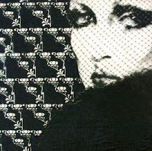
Each season the Lanvin campaign is highly anticipated, mostly because there's no telling what it will look like. Most of the time that anticipation pays off, with Alber Elbaz and Steven Meisel delivering unusual, striking campaigns that perfectly suit the collection they're selling. While I can't go so far as to say that the Fall Winter 2010 ads have completely failed at their mission, I have no reservations in admitting that I don't think they're the best they could have been, not even close. The weird thing is that, despite how below par I feel they are, they're still pretty dynamic looking. Mostly though I just don't think the spirit of the collection, with it's almost animalic rawness and an unmistakable aggression, was translated into the photographs at all.


First off, I don't like the coloring or the lighting that Meisel and Elbaz settled on. With all of the rich shades of brown, hints of warm, deep jewel tones and tarnished metallics that made up much of the collection I was hoping for and expecting the campaign to have the same kind of warmth and sensuality. Instead the lighting is cold and harsh, which works in some situations, but I don't love it here. I don't particularly love the styling either. I have a soft spot for Patrick Nagel's work, but it's been over two years since designers, photographers and makeup artists began revisiting the 80s and started channeling his white skin/black eyes/red lips look. As dramatic a look as it is, if I have to see one more model made up like one of his portraits or one of the girls in a Robert Palmer video I might crack. But the thing that's bothering me most is that there's something about this campaign that doesn't feel very "Lanvin". dior_couture1245 at the Fashion Spot brought that up, and as I looked at the images more I really did start to agree with him. Part of Lanvin's image is the slight imperfection in the clothes, or styling, whatever, and when you remember that, these super-slick, super-produced images seem very distant from the actual product. For an idea of what I might have liked this campaign to feel like, look no further than Dolce & Gabbana's S/S 2005 ads. I'm not suggesting that's how this campaign should have looked necessarily, although some similarities wouldn't have hurt in the least, but that's most definitely the vibe I pictured for Lanvin this season.

all images from WWD.com via Flashbang at tFS

Friday, June 25, 2010

Quoth the raven...

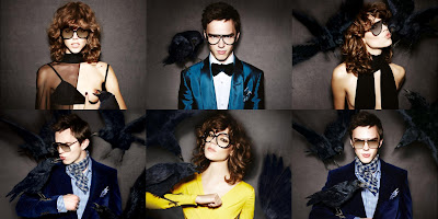
I never thought I'd see a day when Tom Ford would be channeling Edgar Allen Poe for inspiration, and despite his new role in the directors chair I never really pictured him having an Alfred Hitchcock moment either. But if his newest ad campaign is any indication, Tom has a side to him that we've never seen before. Sure, he's tapped into the darker side of things with his fashion, but his brand of darkness has never been of the melancholy, terror filled variety, so seeing these new photos featuring that foreboding symbol of death, the raven, is kind of surprising.


There are many things we have already seen and might expect to see in any ad campaign that Tom Ford touches; ravens just don't happen to be one of those things. Bare nipples, however, are. But as predictable as a bare breast might be for a Tom Ford ad, a bird feeding on the blood seeping from a puncture in said breast is a completely bizarre and unusual sight. Overall I think the campaign is a nice mix of the twisted and the comical. I have to say, I had my reservations when I first read that Freja Beha Erichsen was cast as Tom's female model this season. While I'm not silly or immature enough to call Freja a "man" because she's on the androgynous side, I don't think she's the most sensual model in the world. That's fine of course, her look works for many other things, but for a designer who's M.O. is tapping into the most carnal of human desires you'd hope that the model chosen would match that. While my opinion hasn't changed in that respect, I do think that Freja looks good here. Nicholas Hoult on the other hand I have no complaints about. With those eyebrows of his he can pull of sinister pretty damn well. I find myself wishing it was a larger campaign, because even though the ravens look as fake as they probably are, the photos are pretty cool looking.

all images from tomford.com

Thursday, June 17, 2010

Traveller of both time and space...

Haider Ackermann

So in case you haven't yet heard Haider Ackermann, he of the draped leather blouson and sylph-like bias cuts, is launching a menswear line. Honestly the only reason I'm posting about it now as opposed to a month ago when it was first announced is because at the time the only thing I had to say was "OMGSTFU". That doesn't really make for the best blog post, you know? Apparently I missed a vital bit of info somewhere along the line though, because I was caught completely by surprise when I saw photos of his very first menswear presentation shown just yesterday at the Pitti Uomo shows in Florence. Not a half bad surprise at the end of the day, let me tell you.

I felt like I had a pretty good idea of what Ackermann's menswear would look like. After all, his women's collections do often have a slight androgyny to them. I was expecting lots of layers that mix tailoring and fluidity, pretty much monochrome colors, and lots of textures. In a nutshell I was really just envisioning more masculine takes on his feminine trademarks, and honestly that vision had me quite thrilled to see the results. While these preview clothes weren't a completely unforeseen curve ball, I have to say they're also not quite what I pictured, and I mean that in the best possible way. The clothing had a vague exoticism, kind of North African harem meets East Asian opium den, but with a decidedly Western sensibility. Silk robes, cropped trousers in brocade, patterned wool, and striped silk, slouchy shirts worn draped into belts and some gorgeous jackets with their sleeves pushed up to the elbow (naturally) were mixed and matched to great effect.


Even though there are multiple layers going on, none of the looks appear particularly heavy to me. I like the kind of adventurous vibe running through it. It makes me think of a man picking up different things during his travels that don't quite go and wearing them together; the black leather hooded vest paired with blood red brocade trousers with a gold pattern woven into them is a great example of that. Now, this being menswear I am of course looking at it with the question of "would I wear it" in the back of my mind. While I don't know that I could ever pull off the total Ackermann look (and frankly I don't think most men will have the élan needed to pull these looks off completely), I can absolutely picture myself trying to adapt it somehow. Not that that's hard, per se; some of the pieces are just downright lust-worthy (I'm thinking of that leather vest in particular). All in all it's a promising debut, and certainly enough of a tease to hold people's interest. You can be sure I'm looking forward to more.

all photos from style.com

Monday, June 14, 2010

Border patrol...


Givenchy


This past year my relationship with Givenchy has been a little, shall we say, tepid. Riccardo Tisci's last few collections haven't done very much for me. It's unusual that I'm just kind of apathetic about his RTW and Couture collections, but his pre-collections usually do leave me a little cold. That's not the case this time around. For Resort 2011 he drew inspiration from artist Frida Kahlo, and thankfully it didn't rely on cliches, nor was it a parade of Kahlo look-alikes. Instead what we got were plenty of Tisci's signatures with a distinctly Latin flavor. Add in a touch of leopard print and plenty of the bold red that appears on and off in his work, and what you end up with is equal parts romance and passion.


I'm not sure what it is about this collection in particular, but I feel as though the familiar Tisci touches - the lace, the ruffles, the tailoring and the transparency - are combined to different effect. None of the collection is particularly new for Givenchy, but I think there is something fresh about this, although I can't pinpoint what that is. I almost feel like there's something more overtly sexy than normal here. I hope the upcoming Haute Couture collection also takes inspiration from Kahlo. Considering that Tisci's resort, men's, and couture collections that were shown within a few weeks of each other last summer shared many similarities, I won't be surprised if I turn out to be right. I'm definitely running the risk of getting my hopes up way too high, but just imagine the possibilities!

check out the full collection at Style.com

Sunday, June 6, 2010

Video: Givenchy Haute Couture Fall Winter 1999

It's a shame that Alexander McQueen's tenure at Givenchy produced such uneven results. I still remember seeing pictures from pretty much all of his collections at the house, and there was plenty of beauty to be seen. But unfortunately whatever tension was going on internally manifested itself in his work while he was there. Not surprisingly some of his most memorable shows for his own label came about during this period in his career, after all, his angst had to have an outlet somewhere. Tension and frustration aside, I remember some of McQueen's early couture collections for Givenchy suffering from a bit of an identity crisis, and on more than one occasion there were echoes (some louder than others) of John Galliano's work for his own label as well as for Dior. With that in mind it's kind of puzzling that this particular collection isn't better remembered or more highly regarded by people, because from what I can recall this collection looks the most like something by Alexander McQueen out of any of his couture collections.

It's not without it's faults, though. For one thing the presentation leaves a little to be desired from a showman like McQueen. While it produced a fantastic video, with closeups of most of the looks that highlighted the amazing details, it's also a little bit like looking at a museum exhibit. I can't imagine how frustrating that must have been for the audience. Also, there isn't much connecting tissue between a lot of the looks. Many of them really have nothing to do with each other, and even though I suppose that's not essential from a couture collection I personally think McQueen was at his most amazing when he was telling a story. But what's done is done, and after watching the video a few times already I think it's best to just approach each look individually and ignore the fact that this is supposed to be a collection. Like I said, it's some of the most "McQueen" looking of all his work while he was at LVMH, and the clothes are just mind-blowingly beautiful. Keep your eyes peeled for the tartan capelet made out of feathers, the tan leather skirt suit with raised flower cutouts, the white and pink beaded gown, and the seafoam frosted glass, yes, GLASS breastplate worn over a ruffled gown at the end. There's something so ridiculous about a garment made of glass, but there's also something tragically romantic about a thing so beautiful that is almost destined to break. Eleven years later knowing how McQueen's life would end, that seems rather fitting.


thanks to stylerunner7 at youtube for uploading.

Friday, June 4, 2010

Glamorama...

Donna Karan

When it comes to pre-collections I usually find myself appreciating Pre-Fall more than I do Resort. I guess it's because more often than not resort ends up looking a little pre-packaged. Even though the season is meant to provide clothing for the transitional period between winter and summer a lot of designers seem to take the mini-season's name literally, as if every fashion-buying woman drops everything in the dead of winter to make a pilgrimage to a tropical climate. By comparison pre-fall isn't as pre-fab. So far none of the resort collections have made any kind of impact, at least not a positive one. There was a Bardot in St. Tropez themed collection at Chanel (not as much fun as it sounds), a positively cavity-inducing collection of pre-feminist cheese at Dior, and a mixed bag of Saint Laurent references at YSL that I haven't made my mind up about yet.

Donna Karan's collection, on the other hand, I've had no trouble making up my mind about. With a palette of black, silver, white and navy and a predominantly slinky, liable-to-fall-off silhouette it'd be weird if I didn't like it. Granted, it's basically limited to clothes that are strictly after dark, but considering that these clothes will show up in stores when it starts getting dark at around 4:30, I don't think that's such a problem. The first look says it all; black smoking jacket, gray silk wrap skirt and silver chain mail top, straight up glam from head to toe. I've never seen chain mail at Donna Karan before, but it actually makes perfect sense. That stuff drapes and clings like nobody's business, and Ms. Karan should consider playing with it more in the future. I'm picturing the results, and they make me happy. The other looks, from twisted jersey cowls to slouchy silk jacket and pant looks, and even a killer white tailored jumpsuit that was equal parts Marlene Dietrich and Studio 54 were equally glamorous. Let's not even get started on the handful of gowns that were shown. The final draped column in silver lamé is just too gorgeous to bear.


But even though 3/4 of the collection makes perfect sense despite how limited most of the clothes are in practical terms, there were a few looks that left me puzzled, and now that I think about it that happens a lot with Donna's pre-collections. There are always a few looks that don't quite fit, whether it's the style, the color, or the shape, though it's generally some combination of all three. This time around the sore-thumbs ranged from a voluminous opera coat that, in a lurid color combo, would have been right at home on a Lacroix runway, a frothy black circle skirted dance dress, and an icky star print that made it's presence known as a bulky parka and a transparent gown that displayed none of the ease, sensuality or technique that I expect from Donna's draping. They're minor quibbles, but when you're dealing with 25 or so looks, the sore thumbs stand out all the more. Since they're the minority they're easy enough to ignore. I just hope the limpid urban glamour that's the focus here is a preview of what's to come for S/S.

Check out the rest of the collection, including the duds, at Style.com