Showing posts with label riccardo tisci. Show all posts

Tuesday, July 6, 2010

Memento mori...

Givenchy

I must admit that when it was announced a couple of weeks ago that Riccardo Tisci made the decision to scale back his Haute Couture collections for Givenchy, nixing a runway presentation and cutting the total amount of looks shown to the press down to 10, I wasn't thrilled. I could see the logic in his choice, because taking a still photograph of a garment up close is the next best thing to seeing it in person (which is what press and clients would be able to do). But I tend to prefer some kind of runway like setting, whether it's a traditional up-and-down runway or something more complex in the vein of old school Galliano. It's not even that I find a static salon presentation boring, it's that it's really hard to give context to a collection when you're simply photographing it in front of a wall. With music, lighting and set design you can create some kind of ambiance that complements the clothes. It also allows a designer to bring the audience into a world of their creation, to give the audience a more multi-dimensional look at what was going through their heads when they designed the collection. I also wasn't thrilled about the fact that last season's clunky, and honestly borderline ugly collection would be the last impression of a Givenchy couture show, until further notice at least. But I'm enough of a Tisci fan to have faith that he would deliver something special now that the focus would be entirely on an extremely limited number of clothes. On that count I don't think I was wrong.


Anyone who has been following Tisci's career at Givenchy can view the 10 looks he presented and see things that are similar to work he's already done. For the first time though I don't see that as a negative thing. My rule for designers is that if they're going to revisit something they've already done or rework a piece from their past they had better improve upon the original. In my opinion it's rare that that actually happens. I can't speak for everyone, much as I might like to, but I think that this time around Tisci actually did manage to take those old ideas and make them better. Each one of his ten looks had something familiar about them, from religious motifs to heavy beadwork, geometric cuts to intricate embroideries and appliques. But even at their most baroque, as in a narrow column dress completely encrusted in gold sequins and beads, the clothes didn't seem as labored as they sometimes have in the past. They were detailed to nth degree, no doubt about it, but I really don't think any of the clothes felt overwrought. Tisci's use of his inspiration felt completely under control as well. Even something like lace applique in the form of the human skeleton doesn't seem as gimmicky as it could have been. In fact, I think there's something really beautiful in that blend of purity and darkness, beauty and physical decay. You could also make the connection between the reminders of mortality as seen in the porcelain skulls that apparently adorn some of the white jackets and the seemingly imminent death of Haute Couture.

So yeah, I'm not entirely in love with this scaling back thing. At the very least I would have like to see a larger collection. But then I stop and think to myself that if scaling back was what it took for Tisci to make clothes that are this beautiful and this focused, then I really shouldn't have anything to be upset about, should I? If it wasn't for how small the collection was, I might go so far as to call this Tisci's best couture collection yet.

Unfortunately there's some copyright issue going on with the images Conde Nast is using at the moment, so you'll have to go to Style.com yourself to check out better quality images and rear views of each look. I'd recommend viewing them in full screen mode.

all images from WWD.com

Monday, June 14, 2010

Border patrol...


Givenchy


This past year my relationship with Givenchy has been a little, shall we say, tepid. Riccardo Tisci's last few collections haven't done very much for me. It's unusual that I'm just kind of apathetic about his RTW and Couture collections, but his pre-collections usually do leave me a little cold. That's not the case this time around. For Resort 2011 he drew inspiration from artist Frida Kahlo, and thankfully it didn't rely on cliches, nor was it a parade of Kahlo look-alikes. Instead what we got were plenty of Tisci's signatures with a distinctly Latin flavor. Add in a touch of leopard print and plenty of the bold red that appears on and off in his work, and what you end up with is equal parts romance and passion.


I'm not sure what it is about this collection in particular, but I feel as though the familiar Tisci touches - the lace, the ruffles, the tailoring and the transparency - are combined to different effect. None of the collection is particularly new for Givenchy, but I think there is something fresh about this, although I can't pinpoint what that is. I almost feel like there's something more overtly sexy than normal here. I hope the upcoming Haute Couture collection also takes inspiration from Kahlo. Considering that Tisci's resort, men's, and couture collections that were shown within a few weeks of each other last summer shared many similarities, I won't be surprised if I turn out to be right. I'm definitely running the risk of getting my hopes up way too high, but just imagine the possibilities!

check out the full collection at Style.com

Wednesday, July 8, 2009

Under the sheltering tent...


Givenchy


It's been interesting, over the last month or so, to see the way that the three Givenchy collections presented in the same time frame have related to each other. It started with the Resort 2010 collection, continued with the Mens show for S/S 2010 two weeks ago, and culminated with the F/W 2009 couture collection shown yesterday. All of these collections, which are worked on simultaneously at some point or another, have been influenced in part by North Africa, though in Tisci's hands you can bet that you won't get something all that literal. After seeing the resort collection in June, and then the mens show later in the month, I felt pretty confident that the couture collection would be in a similar vein. It wouldn't be the first time that Tisci's resort collection has been an indicator of the couture show that's shown after it, but even still, knowing the vague direction that this couture show would go in I didn't know what to expect, and in a way that's become one of my favorite things about Riccardo Tisci. He keeps your attention.

The show opened with a double breasted black velvet coat that had an exaggerated hourglass silhouette and a sheer hood, and right away I loved the look. It reminds me a lot of a coat Nicolas Ghesquiere did in his F/W 2001 Balenciaga collection, same wasp waist and all. That's not a put down though, and the silhouette feels somehow fresh for Riccardo. Then came a second coat in strips of exotic leather with a similarly curvy shape, followed by a velvet jacket with built out hips worn with matching trousers. These few looks, though easily the most simple in the collection, were also some of the ones that excited me the most. Don't ask me why, I couldn't tell you. Then comes look four and you're pretty much whacked over the head by the impact; a black hooded cowl top with full, draped zouave trousers accented with huge golden bibs, facemask and bangles, a look clearly inspired by traditional womens fashions in Muslim and Islamic cultures. After this look there was a black velvet jacket worn with ballooning trousers embroidered with gold beadwork in a vaguely Moorish/Moroccan pattern. I honestly hate the silhouette, but the beadwork on the pants is absolutely gorgeous. There was a flowing black draped chiffon mermaid gown, worn with that same heavy gold jewelry which was followed by my favorite look in the collection; a black turtleneck top paired with a high-waisted black mermaid skirt covered in sequins that had sculptural detailing at the waist. There were jet beaded zouave pants (which looked just as unfortunate as the ones Balmain showed for fall), and a stunning high-necked long-sleeved jet beaded gown with spikes protruding around the chest and shoulders.


If you view the collection in order, look 10 comes as quite a shock after the black looks that opened the show. A pale beige gown with strong shoulders and a plunging neckline was decorated with inexplicable hot pink beading around the shoulders and below the waist. This dress was followed by another with cutout sides and a keyhole neckline, this time embellished with bright green jewels at the hip and scattered down the skirt. Both of the dresses were really quite pretty on their own, and the fabric had some kind of subtle design woven into it, but those garish, cheap looking embellishments made me cringe. In all fairness the green version is slightly more appealing than the hot pink one, but still, it's like taking a beautiful painting and putting it in an ugly frame; the accent ends up taking away from the beauty of the artwork. Then came an ecru jacket cut with asymmetrical flyaway panels at the hem in signature Tisci style worn with tapered trousers. The jacket was embellished with red beadwork in a tribal kind of pattern that was pretty, but having seen an HQ image I have to say I would rather that the detail had been embroidered in thread rather than the chunky plastic beading. It would have been more refined looking. Following this was a strapless gown in degrade silk that went from ecru to intense red at the hem. Compared to the garish neon beading, this use of color actually made sense in the context of the collection. Another look had a top in white with an asymmetrical train draped off the side and back that had illusion sleeves embroidered with more of that red tribal bead-work. Again, I wish the beading had been done more subtly. Even changing the beads to smaller shapes would have helped. I'm just not digging the chunkiness of it. Billowing white veils covered two strapless, embellished bustier looks, one with pants, the other with a sheer skirt in chiffon that I can't wait to see in motion once the videos start popping up. A white sheared fur jacket was embellished with gold studs and chains, and here I thought the chunkiness of the embellishment worked. A strapless white dress was also embellished with gold studs and had an underskirt in black peeking out. And the final dress, strapless, white with embroidered patterns on the fabric and an angular infrastructure giving the silhouette a jagged sort of shape, was kind of dull compared to everything before it. It definitely wasn't a "finale" look, that's for sure.


First for the positive; I love pretty much all of the black looks that comprised the first half of the show. They were beautifully understated and kind of fresh for Tisci. I also love the inspiration behind the collection, and in Tisci's hands it yielded some interesting and beautiful results. The mystery, drama and sensuality of North Africa combined with the incongruent elements like spikes, studs and corsetry worked surprisingly well, and it's nice to see him playing with ideas he's toyed with less successfully in the past (hardware and fragility being one of them). Now for the negative. First, there were just too few looks. Givenchy has majorly skilled workrooms and plenty of people working in them, so there's really no reason why the collection should only contain 21 looks. I'm not asking for some lengthy 40-plus look parade, but 21 is cutting it way short as far as I'm concerned. Besides that, the less looks you have, the less room you have to really say what you're trying to in a coherent way. That was another negative, the coherency was definitely lacking here which is unusual for a Givenchy couture collection. Even when he throws different looks and different ideas out there in one collection there is almost always a good progression, and everything makes sense. But that wasn't the case here. It was too scattered. What did those two neon embellished gowns have to do with anything else he showed? Why was that corseted tailoring that opened the collection dropped after the first few looks instead of expanded upon? I awaited this collection with the standard he set last season weighing heavily on my expectations and unfortunately it didn't quite live up to them, which is disappointing. Also disappointing, but maybe not really worth complaining about, is the fact that a lot of this collection is familiar coming from Tisci. Yeah, the look and details aren't the same, but unlike last season this is all stuff we've seen him do before, and my policy on that is if you don't improve upon something then you shouldn't bother revisiting it.


all images from Style.com

Tuesday, May 26, 2009

Bitchin'...

So here we go folks, a brand new ad season is closing in and the first glimpse of something new is a preview of Givenchy's F/W 09 campaign. I've never been really wowed by a Givenchy campaign before, often finding them boring and kind of uninteresting. Since Riccardo Tisci started in 2005 his campaigns for the label have been shot by Dutch duo Inez & Vinoodh, which could perhaps be why I've never been especially moved by them (I don't want to say I've never liked anything by I&V, but it's rare that I do). But in the past, despite not liking the images much, I have always been intrigued by Tisci's choice in models which can only be described as eclectic. Lately he's been mixing hot new faces (Iris Strubegger, Edita Vilkeviciute, Lakshmi Menon), Givenchy perennials (Lara Stone, Mariacarla Boscono, Natasha Poly) and interesting curveballs (Frankie Rayder, Ujjwala Raut, Kristen McMenamy, Adriana Lima) on his runways to great effect, and the result is some of the most interesting casting around. This season Tisci decided to replace I&V with another dynamic duo, Bourdin-worshipping golden boys Mert & Marcus. I have sort of a love/hate relationship with M&M. Occasionally they really bring it, but more often then not their formula of inhumanly airbrushed perfection and cartoony color just grates on my nerves and bores me to tears. So I wasn't really sure what to expect when the results were unveiled. The fact that for a while Adriana Lima was the only girl mentioned as part of the cast wasn't exactly reassuring. However, what we wound up with is actually pretty solid, if the preview is anything to go by. Set in a fancy-pants boudoir, the cast, with their death stares and severe makeup, looks like some kind of really chic cult of sexual predators or something along those lines. I really like the contrast between the fussy interior and the aggression of the girls and clothing. Then there's Adriana's solo shot. It's kind of what you'd get if you crossed a George Hurrell photo of Jean Harlow with a Marilyn Manson groupie circa 1997, and I mean that in the best possible way. She looks nothing like "Adriana Lima" the bubbly, boobalicious, ultra-glossed Victoria's Secret angel everyone loves, and for that alone I'm kind of impressed. I wouldn't have thought it possible. There's also this Leonor Scherrer, the one who looks quite a bit like Malgosia Bela, thrown into the mix. Until I read the blurb posted from WWD on tFS, I had never heard of her before, though I found out she's the same woman I had seen in a picture by The Sartorialist that I loved. Overall the result is pretty different than what I would have expected, and if I didn't know that Mert & Marcus were behind the images I probably wouldn't have guessed it.


I don't want to say that I'm in love with them just yet, because I've yet to see the rest of the campaign and it'll probably be a few more weeks at least until more campaigns debut, but there is something about these that I like very much. Hell, it could just be that I really like the cast and the look, the whole "I might drain your blood as foreplay, I might not" kind of vibe. One thing's for sure, I can't wait to see more.

All images from wwd.com via MissMagAddict at theFashionSpot

Thursday, April 23, 2009

Video: Givenchy Fall Winter 2009/1010

So ever since I first saw the Givenchy collection for F/W 09 back in March when it was shown I've been dying to see the video. A big reason for that is because Riccardo Tisci tends to put a lot of detail in the backs of his garments, and unfortunately the "one-way runway", as I always call it, doesn't allow for many photos of the back view. Speaking of back views, in my review of the show I mentioned how I was dying to see the back of the white draped halter neck gown with feathered shoulders, and it totally didn't disappoint. I mean, I had a feeling that it would be backless, but still.....


I've got to say, in the month or so since this was shown and now having seen it in motion, I really do think this is my favorite Givenchy Ready to Wear collection that Tisci has ever done. It's well made, it's glamorous, it's a little hard edged and a little romantic too. But best of all, it's crammed full of gorgeous, wearable clothes, and that's not something that can be said about a whole lot of collections.


Tuesday, March 10, 2009

Angels and Demons...

Givenchy

There was a lot riding on the Givenchy collection for me this season, mainly because the couture collection shown in January made such an impression on me, and while Riccardo Tisci didn't exactly exceed my expectations he did meet them, though not in the way I would've expected. I was hoping that the lightness and the softness of the couture collection would translate into the ready to wear, but instead we got more of Tisci's very dark, very strict and somewhat aggressive romanticism. I'm not complaining however, since it was really a collection that took many things that he has previously explored in his early days at Givenchy and removed the tortured student aspect to produce a blend of dramatic experimentation and truly gorgeous, wearable clothes.

In seeing the first images as they came out I got a sort of fallen angel vibe from what I was saw in them. White ostrich feathers decorated one look while leather sleeves or chains decorated another. But, as is always the case with the first images that get published by the news and media websites, the images weren't in the order that the looks were shown on the runway. Now after seeing them in the correct order I see that my original take was actually kind of backwards. The collection seemed more about demons becoming angels rather than the other way around. According to Tisci though, the collection actually has nothing to do with mythology or religion. He was inspired, at least in part, by Elsa Schiaparelli's work during the late 30s and early 40s. It turns out that Hubert de Givenchy worked for a short period of time as an assistant to Schiaparelli (you learn something new every day) and that Tisci saw some of her influence in the archives. Combine that with raw, animalistic sensuality and what you get was this collection. However, I kind of like my spin on things better, and that's what I'm sticking to. Really though the collection did proceed a bit like Dante's "Divine Comedy", starting where else but in Hell. Out came a parade of sinners and demons, starting with sharp pagoda shoulders and strict tailoring all in black. The first dress had those pagoda shoulders, built over a regular fitted sleeve on one side with tufts of some kind of fur sticking out from underneath, and a similar top was paired with a shiny eel leather pencil skirt. Full cut trousers had drapes and geometric pieces worked into them from the waistband. One pair was worn with a sheer top that had a sleeve covered with a combination of shaggy hair and ostrich feathers that appeared to be harnessed to the body, while another pair of trousers was paired with a simple turtleneck sweater that had leather sleeves. And there were two dresses that also used that shaggy hair and ostrich feather combination on sheer bodies that definitely had a beastly, demonic sort of vibe that I actually kind of loved.


After that there was more sharp tailoring, from pants suits and coats in a gorgeous textured black wool with leather sleeves, to simple wool crepe trousers worn with an organza and leather blouse that had a black coneshaped bra worn underneath, a one sleeved sheath worn with a fur capelet and a fitted skirt suit with an oddly draped, but very beautiful skirt worn with a huge metal chain around the waist. Here was also where Tisci started to lighten the colors, segueing from black into navy blue by way of black/navy checked wool tailoring. From there he sent out sheer blouses in plisse silk worn over those cone bras, simply draped organza tops, a coat worn with a black fur collar and another trimmed with ostrich feathers, some more of those trousers (really the best pants I've seen all season) and a fantastic pantsuit that had a double peplum effect at the waist. I'm pretty sure the pants underneath have it's own peplum as opposed to the jacket having both of them, but I'm not positive. Either way, it's great looking. Mixed into the navy stuff was a look that was one of my favorites in the lineup; a fox jacket with leather sleeves worn over a fluid black dress with a deep v-neck. There's something incredibly glamorous about it that I can't put my finger on, and why such a simple look stands out to me I don't really know, but it does. I'd love to see more of the dress underneath, because knowing Tisci it's not as simple as it appears to be.


After the navy looks things started to lighten up, literally. Ecru tailoring and ivory lace came into the picture, though, this being a Riccardo Tisci designed collection that ivory lace wasn't exactly virginal. Worn with those recurring cone bras and built out with sparkly cobalt shoulder pads, the three dresses were really the only flat looks in the collection. I just don't think they added anything, and I don't think the collection would have suffered if they had been left in the studio. As it is the angular tailored looks with vests or stoles in ostrich feathers that bookended the lace dresses were much more appealing. After that there came three looks in a sort of mint-tinged white color completely covered with silver studs. The caped jumpsuit I could live without, but the two drapey dresses were a nice contribution to the growing trend this season for completely covering a garment in hardware. It's not hard to figure out why designers are making clothes look like armor, tough clothes for tough times and all, but I'm actually really liking some of the results on a purely aesthetic level. The pieces here, as with the pieces at Cavalli in Milan, have a great movement to them due to the weight of the metal on the fabric. How wearable they all are remains to be seen. After this trio came a mish-mash of looks, which is kind of unusual for Tisci since he tends to divide his collections into sections based on color, shape or details. There was a black leather coat worn open over a cone bra and trousers, a gorgeous long sleeved black dress with a cowl draped into the front with strands of beads attatched, some white tops with strands of beads that were covered in fabric worn with black pants or a twisted shiny leather skirt and some draped sheer black looks that combined fishnet, chiffon and chains. One of them, a long dress, was strangely beautiful, though the top made in the same way and worn with draped trousers was a much more approachable option. If the black section was Hell, then middle portion of the collection was Purgatory. The sinners aren't quite purified yet, their sins still weigh on their souls and keep them from Heaven....or whatever. Then of course, after paying your dues in Purgatory there's only one place you can wind up. Pure white draped gowns, and what looks like a jumpsuit, had "wings" made from a combination of ostrich feathers and pleated fabric. My personal favorite was also the simplest; a fluid halter neck colum with some feathers sprouting around the shoulders. I'm dying to see what the back of it looks like. But apparently these angels weren't quite purged of their sins, because the last look out was anything but pure; a black top with a deep v neck and draped trousers accessorized with some kind of bolero or jacket covered with fans of white fabric in the front and more of that shaggy beast hair in the back. I guess Heaven wasn't really their thing afterall.


I have to say, I really thought the collection was great. It may even be my favorite ready to wear collection Tisci has ever done. He managed to touch upon so many of the things that are huge this season, strong shoulders, architectural cuts, sharp tailoring, armor, barbarism, texture, the 40s, extravagent fur, and make them all work together in one collection without coming off as disjointed or worse, overloaded. Most of the clothes he showed would look gorgeous on a variety of women, from the fabulous pants, to the sharp little jackets, the interesting skirts and even some of the dresses. My only complaint would be the editing. I would've liked to see the black and white looks that were interspersed before the all white eveningwear worked into the collection better instead of just jammed in between two sections of solid color. Even if the whole "angels and demons" thing is total b.s. on my part, as I suspect it is, keeping the collection broken up into sections of black, navy, beige, and white would've just made for a really nice progression. But it's a minor complaint, and really, the only looks that I truly dislike are the three lace dresses. So maybe this season isn't the season that Riccardo decided to throw a surprise our way and continue with the color, softness and lightness he touched on in his S/S couture collection, but what he offered instead is still pretty damn great.


all images from Style.com

Tuesday, February 3, 2009

Like a virgin...

So kids, I'm sure you've all just been dying to hear my take on the Spring/Summer 2009 couture collections. Unfortunately, the real world called....and called, and called, and called until finally I had to answer. Luckily, I'm back to focusing on the wonderful little bubble of beauty and bitchiness called fashion.

Well apparently white is the new black if the recent couture collections are anything to go by. It's strange. Every season when the handful of couture houses present their collections there's always some common thread throughout most of them despite the fact that the designers themselves couldn't be more different. This season the major similarity in all of the collections is that classic non-color representing purity, virginity, lightness, delicacy and space. Perhaps that's why I'm not loving it...not that I mind white clothing per say, but when it seems like every collection I've seen in a 3 day period has had an abundance of white I think it's fair to say that I've had my fill. In a way it's kind of easy to read into. Things are in a pretty dismal state these days and there doesn't seem to be any quick turnaround in sight. You could say that all this white perfectly mirrors how bleak the world seems....I'm not actually saying that though, just throwing the suggestion out there. Every big name collection shown featured it's fair share of white. Dior showed it as taught little cocktail sheaths or full skirted ballgowns decorated with Delftware patterns in shades of blue. Givenchy sent out a procession of Vestal Virgins in a take on a broderie Anglaise. Gaultier had thick bands trimming a plunging black V-neck. But the biggest and whitest of them all was Chanel, where Karl Lagerfeld kept his lineup almost exclusively white on white. We'll cover all this and more in due time.

So the inevitable question has of course come up this season of how couture is relevant in a world that is slowly going broke. The fact is it's not, but couture hasn't actually been relevant in a long time. And besides, I highly doubt that the women who can actually buy couture need to worry too much. Oh sure, their husbands might tighten their budget a bit, but the way I see it, if they can still even consider buying couture then there's no point in trying to make couture relevant for the tough times we're in.


Dior

Dior. Dior, Dior, Dior. Just thinking the name makes me feel exasperated at this point in time. It has so thoroughly slipped from it's place of relevance, creativity and prestige that every season I wonder to myself why I even bother looking at the collections anymore. It only ends up disappointing and frustrating me. Does that make me some kind of fashion masochist? Or worse....a delusional optimist hoping against hope that this season will be the season that things finally turn around, or even offer a glimmer of hope that things will turn around. Looking back it's so clear to identify the turning point when Dior slipped into this rut, and the answer is bound to upset or offend someone. The Spring/Summer 2007 couture show was the moment when John Galliano got lost in Dior's heritage and as of right now he has yet to find his way out. Yes, that collection was mind-blowingly beautiful, but it was also the first time where he treated the Dior archives with devout reverence. Before that, he thought nothing of taking the heritage of Dior, the tradition of overt femininity and elegance, and subverting it in an effort to make things contemporary, brash and powerful. It certainly couldn't have helped that soon after the S/S 07 show he lost his right hand man and longtime collaborator Steven Robinson. So now here we are, in a place where all of John Galliano's skills, imagination, passion and genius are being squandered while he's trying to hold on to a form of elegance and sophistication that has absolutely no relevance to the here and now. Is it any wonder that looking through the photos of his collections (I really don't even watch the whole videos anymore) I always feel like I'm banging my head against the proverbial wall?

This season his inspiration came from Vermeer, Van Dyck and of course, Christian Dior. Now, I have nothing against the Dutch Masters. Nor do I have anything against Flemish baroque portraiture. I don't even have anything against the New Look, but this is all territory that Galliano has visited in the recent past. His S/S 05 collection was heavily inspired by 16th and 17th century Dutch art. And his F/W 07 Bal des Artistes collection paid tribute to all of those Baroque masters, in some vague form or another. So right off the bat I wasn't exactly thrilled. The only difference between those collections and this one was that the "Diorness" was much more literal and dragged the collection down. One of the predominant looks in the collection was yet another take on the nipped-waist, full skirted Bar suit, this time with stiff, standout skirts with scrolling hems that bounced as the girls walked paired with those padded waist jackets. Shown in golden yellow, Delft blue, white and red, they really didn't do very much for me. Even though the skirts were probably meant to give of a suspended, light sort of feeling, they ended up looking clumsy due to the afformentioned bouncing. The fact that the stiff fabrics that these looks were rendered in showed every crease near those hems didn't help matters. The two best looks were among the simplest; an ivory tailleur with an off the shoulder jacket that had full, honeycomb pleated organza sleeves and a slim skirt with oversized cartridge pleats at the waist, and a slim off the shoulder white sheath, also with a cartridge pleated waist and a corseted torso with tonal embroidery on the skirt. Neither of them were anything remarkable, and the poor little sheath shown on Chanel Iman was practically drowned out by the colorful, voluminous looks that dominated the lineup, but both stood out for their simplicity and the fact that they were just downright pretty.


After the repetition of the skirt suits and clumsily draped cocktail dresses, the collection segued into evening. What used to be Galliano's specialty has now become formulaic and not even all that beautiful. I think the single most frustrating thing about this current state that Dior collections have gotten stuck in is the fact that he has all but abandoned the one thing that he's so well known for; bias cut siren gowns. He hasn't shown a column of liquid silk satin cut to mold around the body in so long, and I just can't figure out why. He's proven time and again how talented and versatile he is, so why is he wasting the skill that made him famous in the first place? It's absolutely baffling. This season he sent out some mostly forgettable structured ivory columns before moving into a parade of ballgowns. Some had Delftware inspired embroidery, others featured trim in handpainted floral prints and swags of fabric draping around the bodice and skirt. In shades of ivory, pale pink, blue, peach and coral, they were definitely lacking in the sophistication department. They looked heavy, retro and very much like the cliche of a "Couture" dress. Then he sent out a finale gown straight out of a Renaissance fair; blood red, an off-the-shoulder corseted bodice with dark floral trim, and tired ruffles trailing down the back. For every accusation that's ever been hurled at him that he designs costumes, this gown was probably the single most costumey thing I've ever seen from him. It could be straight out of a period film or costume rental store.


Honestly this collection was even more of a disappointment than the last few have been. Even though last season's foray into extreme delicacy and elegance was a largely predictable homage to all things Dior, it was still beautiful and a little bit sexy in places. This though, besides being a flat and lifeless affair, wasn't even that pretty and worse than that, it was kind of sub-par in the craftsmanship department.....and while that's always a no-no for couture, it's shocking considering how refined Galliano's finishing always is. Every season I feel more and more frustrated by Dior couture. Not to sound completely melodramatic, but it's becoming kind of painful to see Galliano destroying his reputation this way. Galliano has always been that rare breed of designer that's truly an artist. He imbued his work with his blood sweat and tears, and you could always tell that he truly put his soul into it. But these last few seasons, well, I can't say for sure if he's still putting his all into his work at Dior, but it certainly doesn't seem that way.


Chanel

I have a theory; Chanel is to couture what the heartbeat is to every living thing. It's the one house that let's you know that couture is alive and kicking. As long as it's there, couture will never die. It probably has something to do with the, er, tenacity of it's namesake, Coco. But over the last few years, I feel like Chanel couture collections have fallen into a bit of a routine. Spring is always very light, very airy, very feminine and very delicate. Fall on the other hand is usually a bit more baroque, heavier in the textures, colors and decoration. Spring especially though has gotten a little frustrating for me because every season there's a lot of white, pale pink and soft grays, ostrich feathers, tulle, flowers, and ultra delicate beadwork. Besides the fact that the craftsmanship is impeccable, and the results are almost always without flaw, I'm always left wondering what all of the fuss is about because really, Lagerfeld isn't actually doing anything new season to season. Like Dior, it makes me yearn for earlier days, maybe circa 2001/2002. Those collections were all based around simple ideas that in turn became amazingly chic clothes. And they didn't fall into predictability. But who knows, maybe nothing has changed except for me. Maybe I'm becoming jaded, I've come to expect too much from fashion and now take beauty for granted. I just don't know.

Anyway, this season Lagerfeld went to extremes, making almost the entire collection white. The only other color that appeared, and very sparingly at that, was black. The collection was inspired by paper, and you could see it throughout. From the sharp, neat little lines on the jackets and skirts that opened the collection, to the headpieces which, I think, were the most incredible thing in the collection. Each one, and no two were exactly alike, was made out of paper. Flower buds, braids, laurel wreaths, and for the bride at the end, a giant camellia that was in bloom around the face all made an appearance. Now I know that Lagerfeld is no stranger to accessorizing his Chanel collections from head to toe, but I actually think these creations distracted from the clothes.


The opening looks, small boxy jackets with neat, raised collars and A-line skirts, paired with the big dramatic floral headpieces, actually looked more Valentino than Chanel...at least to me. I can't put my finger on exactly why I feel that way, but I can't possibly be the only one who sees it, can I?


After about the first dozen looks I have to admit, my eyes were starting to glaze over. Seeing so much white completely obliterated the individuality of each look to the point that they started looking the same. It's strange, I don't usually mind seeing an abundance of black, but I was not a fan of seeing this much white. Maybe it's because the details all got so lost on these clothes...at least in the pictures. Thankfully Lagerfeld relented a bit and introduced a bit of contrast into the mix courtesy of black piping around the edges of suits, bands of paillettes defining the waist and a dress scattered with black embroidery.


After showing some more white, Lagerfeld sent out some all black looks. A simple shift with cap sleeves was entirely embroidered in black bugle beads which only enhanced the linear quality of the dress and it was easily my favorite piece in the collection because it was in such stark contrast to everything else. Then came three dresses in a black and white blurred floral print which, quite honestly, were very New York Fashion Week looking. After this came the evening dresses, straight columns with a black geometric patterns covering the white surface, layered tulle embroidered with rosettes and a pair of skinny trousers with a strapless embroidered top all made an appearance, though the connection to the inspiration became pretty much non-existent. The bride also wore pants, paired with a tunic-style with a long, ruffled train coming out the back.


Overall it was very beautiful, but kind of bland. I mean, I can only handle so many variations on a white shift with white floral embroidery before I lose interest. Yes, couture needs to be relevant to the times we live in, and Lagerfeld almost always manages that end of things by making clothes that truly are wearable to those members of a certain income that has a lot of zeros, but does excitement and a little bit of drama need to be sacrificed to achieve wearability?


Givenchy

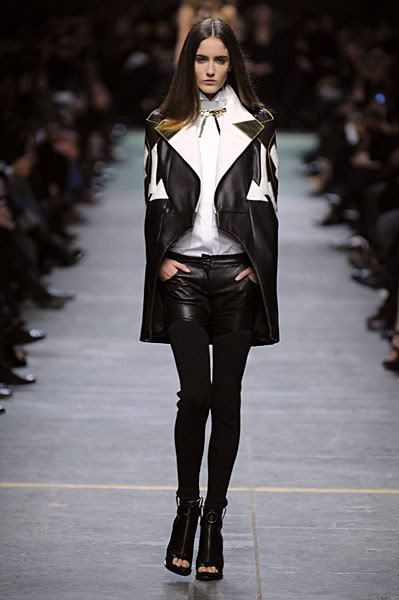
In his three and a half years since he started at Givenchy, Riccardo Tisci has very quickly established a look and spirit that is instantly identifiable. Super slim trousers that could be leggings, masculine influenced jackets paired with delicate, feminine blouses and long, draggy, wraithlike gowns all rendered in a dark, tortured palette and shown in an equally dark and tortured setting. While I have occasionally been a fan of his haute couture collections, both of his couture collections for 2008 left me completely underwhelmed because he was basically just repeating ideas that he had already explored. It seemed too early in his career to be treading water and reworking pieces from past collections rather than creating something new. This season I was completely prepared for yet another procession of Tisci's signature doom and gloom, but thankfully I was caught completely off guard. The usually dark runway was strewn with pale, colorful rose petals and the very first image I saw was a draped, bondage straped gown in a painterly purple floral print. What was this? Givenchy doing prints, and a romantic, colorful floral print at that? Then the photos started coming in. Gone were the dull browns, blacks and grays of past Givenchy collections. Instead we were seeing ivory, dusty lilac, pistachio, pale yellow and alabaster. It was like an immediate breath of fresh air, and it certainly made me sit up in my seat and wait anxiously as more pictures came in. As the photos were posted on the Fashion Spot, it was clear that even though things wouldn't stray too far from Tisci's aesthetic, this collection was going to be different.

Inspired by a mix of the exoticism and eroticism of Lawrence Alma-Tadema's Pre-Raphaelite paintings, the minimal, flowing dancewear of Pina Bausch and a touch of bondage carried over from the spring RTW collection, what Tisci presented was a collection that was not only quite beautiful, but also proved that he's willing to make an effort to push himself. The show opened with an alabaster dress that had exaggerated puff sleeves, a fitted skirt with body-con seaming and a top portion that was done in transparent pleated silk that offered a glimpse of the harness that criss-crossed the chest. Next was a suit, the jacket with similarly exaggerated shoulders and fitted like a glove. Then a draped white blouse paired with yet another fitted, seamed skirt and worn with a massive metal collar. Soon after he sent out dresses in transparent silk that flowed around the body in organic looking drapes. I especially liked the one shown on Jourdan, with that gorgeous crinkle pleated texture in that incredible buttercup yellow color....and I don't even really like yellow. There's just something about it, the color, the lightness of the fabric, the ease of the silhouette that really says springtime.


From here Tisci sent out a small section of draped white dresses with delicate cutwork reminiscent of broderie Anglaise if it was blown up and distorted. Some of them featured elastic bondage underpinnings while others had draped hoods that covered the face and led into plunging necklines. I've been thinking of these looks as the "Vestal Virgins", and it really is quite fitting. They do look like priestesses off to some pagan ritual, don't they? I actually really like the clash between the super delicate fabric and the bondage bits underneath. It's a great contrast, and since it's rare that you see bondage inspired fashion done in pristine white, it's a bit unexpected.


From here Tisci went into evening. Flesh and pale mint gave way to lilac, black and those aforementioned floral prints. Shocking for a Tisci collection, he only used black for the last five looks, and you really can't even count the printed dresses as being black since the purple print is really what stands out. Some of the simple, toga-like draped dresses featured big crystal brooches that looked as if they were what was holding the entire thing together, while two of the flesh colored dresses had this really intricate embroidery or something covering the surface. I actually can't really tell if it even is embroidery, or if it's the fabric itself, but it looks really beautiful against the skin underneath. The three lilac gowns, all a narrow silhouette that gently fluted out below the knee, featured chains trimming necklines with ostrich feathers or completely covering the top in rows, or chain mail that draped across the bodice and waist to give the body some movement. Then came the two floral printed gowns with corseted bodices and straps lashing the shoulders and waist. It seems that the main focus of the collection was taking design elements that are traditionally quite tough and aggressive, like bondage, corsetry and hardware, and softening them. It really was quite interesting how that played out, and it didn't even really dawn on me until after I had looked through the show a few times. To conclude, Tisci sent out three gowns in black, one was trimmed with ostrich feathers and featured transparent insets, another was slightly drop-waisted and had bondage straps around the hips, and the final one featured a simple, plunging v-neck and had voluminous pleated and embroidered sleeves. The last one reminded me quite a bit of his S/S 07 couture show, which also featured gowns with big, face framing pieces that featured beaded sea anemones, leather scales and coral branches. This gown however was a bit more subdued and I'm pretty sure the sleeve and collar portion is a separate piece.


Overall there wasn't much that I didn't like about this collection, and I would definitely say it was my favorite of the week. The great thing about it is that you can totally see the inspirations in the clothes, I mean all you have to do is Google Alma-Tadema or Pina Bausch and it's right there in front of you, but the collection really didn't stray into theme-y territory. I can totally picture a certain type of woman looking amazing in most of it, and I really want to see something from the collection at the Oscars (Eva Green, that means you!!!). While this wasn't Tisci's best couture collection (that honor still goes to S/S 07) it was certainly one of his best because as I said, it's clear he wanted to push himself into areas that he's not naturally drawn to, and it really made for some great fashion. I certainly hope that this new found freedom to explore carries over in his RTW collection come Paris fashion week.


Jean Paul Gaultier

Every now and then a designer manages to find inspiration in some of the most unassuming little places. That was the case this season for Jean Paul Gaultier. His inspiration was calligraphy, specifically the kind used on the edges of currency. You just have to love how dead on Gaultier's timing is, and honestly, if it was anyone other than him that inspiration would probably have just served as a depressing reminder of what's going on in the world. Luckily Gaultier is one witty fellow who knows how to handle his puns. The collection, like most this couture season, was light on color focusing mainly on graphic black and white. But where the Chanel collection had virtually no contrast, Gaultier's show was full of it. The show started, as most Gaultier couture shows do, with some of his signature sharp tailoring. This season he focused on straight, extended shoulders. Some were quite tame, like the one shouldered "Smoking" dress on Ines de la Fressange, others were more exaggerated proving that, at least as far as designers are concerned, the shoulder pad is anything but a flash in the pan trend. Besides the painfully chic Smoking dress, I loved that Gaultier showed pin-stripe power suits. The timing is just so dead on considering how many Wall Street power brokers are losing their shirts (and suits as well, I suspect). In these opening exits the inspiration was handled pretty carefully, a scrolling black pattern trimming the collar and waist of a jacket, beige geometric gridwork on a pin-stripe skirt suit, it was all perfectly chic and, if you didn't know what the theme of the collection was, it would just make for some interesting detail on otherwise classic pieces.


Speaking of details, that's really what made this collection so interesting. Gaultier worked delicate spiraling curls for all they were worth, trimming a nude inset on a white sheath, morphing into fishnet and lace prints on silk coats and as the collection progressed into evening, forming elaborate collars from which the dresses were suspended. Those collars were actually incredibly beautiful and weren't quite like anything I've seen before. One in particular had a metal structure in the shape of a collar and lapel, and in between thin cords criss-crossed in a gridlike sort of pattern. Suspended from this was a simple draped satin column. From the full size pictures, you couldn't even really tell what was going on, and those are the best details in couture collections, the ones that you can only make out from up close.


The evening dresses were where Gaultier really let loose with his inspiration creating dresses of draped fishnet with standup collars, simple goddess colums with insets of inky blue weaving at the waist, graphic geometric corsetry built into nude tulle and a gorgeoous white organza gown with a panniered waist that had delicate scrollwork trimming a sheer panel up the leg and bands of black crin going around the hem. But my favorite piece had to be the black and silver chain mail mini dress on Jourdan. Attatched to the scrolling metal collar that held the dress up were bunches of quill-like feathers, and with the black lipgloss and finger-waved hair she looked like a modern day Josephine Baker.


It was a classicly Gaultier collection, filled with his witty takes on traditional Parisian chic. It was also a much needed return to form after last season's excrutiating neon drag-queen collection, and while it wasn't my favorite collection of the week, it was definitely a close second.


Valentino


So, up until this point I would assume that the title of this entry should be pretty self explanatory. All of the collections mentioned have featured a substantial amount of white clothing. No mystery there. With this collection however the connection is less, er, tasteful. There were plenty of colors in the Valentino collection, the first since the two cobblers...I mean accessories design directors Maria Grazia Chiuri and Pier Paolo Piccioli were appointed as design directors of womenswear. Their first collection, though regarded as a triumph by the leather-faced Maestro and all of his aging acolytes, was a bit like two virgins going at it for the first time; awkward, fumbling and not very good. Hey, I didn't say that the connection to the title was particularly clever or anything...

As anyone with an interest in fashion knows by now, Alessandra Faccinetti was kicked out on her elegantly attired ass by the Valentino people because they, and Valentino himself, felt she wasn't being true to the Valentino heritage. Well, Chiuri and Piccioli were determined to make sure that everyone knew that they had studied and worshiped the archives and fully understand what Valentino is all about. As if it wasn't bad enough that they seemed to have their heads lodged securely up Val's ass, it seemed like he had both his hands firmly up theirs because the collection "they" sent out may as well have been created by Valentino himself. The only thing about it that let you know that the Maestro hadn't designed it was the fact that the technique was so sub-par. Drapes were bulky, details lacked finesse and the evening gowns in stiff silk duchesse and similarly structured fabrics had all the lightness and delicacy of deep fried lard.

The only interesting thing about this collection was the fact that it cast a glaring light on the fact that for years, Valentino himself was entirely out of touch with how contemporary women dress and live. He was stuck in a world of elegance and drama that just didn't resonate with the here and now. But because that was what he had been doing for the entirety of his career, it made sense and nobody questioned it. Plus, his technique was always impeccable. But seeing a parade of pale imitations of the originals was not only insulting to anyone who knows that couture is about perfection above all else, but insulting because apparently this was exactly what Valentino and the people running his company wanted. All they wanted was two sycophants to stroke Valentino's ego and keep things exactly the way they always have been. The whole thing, from the giant "Valentino" scrawled across the backdrop to Valentino's (crocodile?) tears as the designers came out to take their bow and were bowing to the master, just seemed like one giant staged ceremony. It was like that part in Wayne's World when they meet Alice Cooper, except, you know, not funny. Worse than that, if this is the direction the label continues in, and it will no doubt, the label will slip into irrelevance the likes of which only Frida Giannini can relate to.

It really isn't even worth it to post pictures, because if you've ever seen a Valentino couture collection you already know exactly what this collection looks like. There are no surprises, and unless all of the parties involved in the Valentino get their heads on straight, there probably never will be. If this collection proved anything, besides the fact that accessories designers have no business assuming the role of clothing designers, it's that imitation isn't the sincerest form of flattery, it's the cheapest.

All photos from Style.com


Wednesday, October 1, 2008

Midnight Cowgirl...

Givenchy

The cowboy; the iconic image that's become so instantly recognizable and so identified with "America" that it's a wonder the entire world doesn't think this whole country rides horses, wears spurs and....does whatever else cowboys do. Hero to millions of little boys, overzealous straight men, gay porn directors and even, on occasion, fashion designers. No prizes for guessing where this is going.

Today Riccardo Tisci debuted his S/S 09 Ready to Wear collection for Givenchy and the inspiration, I'm assuming anyway, was cowboys. Lucky for us Tisci isn't one for themes, because no theme is more of a one way ticket into full on tacky territory than cowboys. Given that knowledge, there have been many designers who have tapped into the Wild, Wild West. I mean, Ralph Lauren has built an entire facet of his image on it, so it can't be all bad, can it?

Tisci started things off safely enough, with more of the monochrome razor sharp tailoring that he's become so well known for at Givenchy. Into this he integrated some Alaia/Versace-esque bondage, which is the obsession du jour for young designers. Now, I love a bit of kink in my fashion as much as anyone else, but I'm starting to get a little sick of it. Some designers were born to do kink. Others, not so much. Unfortunately the designers who don't do it in a really fabulous way make it so that you don't want to see anyone doing it at all. At least, that's how it works for me. But I digress. For this opening passage, the western influence was pretty subtle, to the point that it was non-existent. He sent out some buttercup yellow and beige organza pieces with triangular scalloping worked in curves around the surface of the pieces. That trimming reminded me a bit of the cut work you see on cowboy boots, but like I mentioned, it's not literal.


Then he segued into trickier territory; suiting with a decidedly Colonel Sanders flavor. I don't care how sharp and flawless the tailoring is, did he have to put that stupid looking little western tie with the looks? On the plus side, Frankie Rayder's feline face made an appearance on the runway in one of the aforementioned suits. Thigh high cowboyish boots made an appearance with a western shirt-come-shirt dress and sheriff's badge brooch.


But then it devolved into full on gay biker bar in the Meatpacking District on a busy Saturday night. You didn't think that gay porn reference earlier was just for fun, did you? Black leather "chaps" were integrated into the cut of bleached denim, one pair even had a "codpiece" worked into the crotch....forget the back, the leg or the decollete, the crotch is the new focus according to Tisci. A crocodile harness was added to the lineup, perhaps as a play to steal the kinkier portion of Hermes' clientele. Even a leather daddy or dominatrix likes exclusive luxury. The worst part (I know what you're thinking, "there's something worse than bleached denim?") was the gold, white and black leather worked into the intricate cut work patterns you see on a vintage country music star's stage wear. Needless to say this portion of the collection was not the most successful for me.


But luckily things perked up towards the end. The sharp shapes that dominated most of the collection were softened up a bit with some fluid draping, which actually looked really beautiful paired with the severe tailoring. The country music thing struck again with giant crystal embellishment on the pieces that could've slipped right into Dollywood land, but stayed just shy of it. Fun fact: during his tenure at Givenchy, Alexander McQueen also did a collection inspired by the American west and, tada!, Dolly Parton. What is it about the house that's so firmly associated with understated, timeless chic that drove two very different designers to explore one of the more kitschy elements of American culture?


Could this be some sort of subtle jab at the way the world has come to view America, or is this just Tisci's attempt to pull a Moschino and insert irony into his clothes? You hear that argument all the time, that it's supposed to be ironic and not as serious as it appears. But here's the problem; irony is pretty much lost on clothing. You don't get humor from a pair of leggings studded with crystals, or a pair of leather pants that look like a tragic mix between Elvis and Ziggy Stardust. Overall I have a love/hate relationship with this collection. The things I like, such as the first passage of looks, I like a lot. The stuff I hate, well....I hate it. Like so many other collections so far this season, I'm left feeling unsure about this. It doesn't excite me, nor does it repulse me entirely. And if Miuccia Prada has taught me anything, it's better to be repulsed than to just be uninterested.

all fashion show images from Catwalking.com via MulletProof @ theFashionSpot