Not many designers can manage to do something interesting with as tired a theme as resort-wear, but then not many designers have as twisted a mind as Miuccia Prada. In rapid change mode yet again (she is the queen of rapid change, after all) Prada ditched the headline making curves of her Fall collection for light, crisp, sometimes boxy clothes that combined such clashing elements as rugby or sailor stripes in a rainbow of crayon colors, prints inspired by baroque-era interiors, medical scrubs, the 20s, the 40s, the 50s, and souvenir t-shirts. The overall effect, at least to me, brought to mind a kind of retro tourism vibe, the look of post-WWII American or European women traveling to places like Cuba, Mexico and Brazil with a brand new wardrobe of clothes perfectly suited to a tropical climate. This being a Prada collection the results had a kind of intentionally cheesy and tacky quality to them.
While I don't necessarily love all of the clothes on their own, I can appreciate them for the most part. For instance, I don't actually like the three chemise dresses embroidered to look like souvenir t-shirts, but I certainly enjoy the humor of them. Same goes for the cartoon banana and baroque monkey prints, which I don't think many people would be able to pull of very convincingly. But they're still pretty clever. The pieces I do like are some of the colorful striped looks. More than sailors or rugby they make me think of beach towels, and that's really not a bad association when you're looking at summer clothes. I also love the fox stoles that a lot of the models were carrying. It's such a ridiculous idea, a fur stole for the summer, made even more ridiculous by the fact that they weren't even being worn. I'm especially fond of the striped ones. With the dangling tails they kind of look like the Cheshire cat from Alice in Wonderland. I don't know if anyone else got that, but it makes me smile, so who cares? One thing that this collection makes clear, yet again, is that Miuccia is undoubtedly at her best when she's fucking up a cliche.
The name itself may as well be fashion shorthand for rapid and startling change. Each season people wait with bated breath to see where Miuccia will go, and the results are pretty much always bound to captivate and alienate due to their unfamiliarity. While Prada doesn't reinvent the sartorial wheel with her work what she does is take things that are mainstream or banal and subvert them somehow, breathing new life into old ideas and changing the eye of the viewing public. A Prada show, more than any other, elicits a strong reaction upon first glance. It's always a love it or hate it kind of experience.
But this season rather than sending out something strange and unexpected Miuccia sent out a collection that was so quintessentially Prada it could almost be considered predictable. From the first look to the last it was a reminder of what the house has always stood for; traditional, nostalgic femininity with more than a hint of oddness. Retro geometric prints in icky colors? Present and accounted for. Intentionally frumpy, cheap looking knitwear? Also on display. Dirndl skirts and A-line coats? The collection was filled with them. Just like with Marc Jacobs' collection in New York this was Prada reworking her own past. But as familiar as all of the elements were, as unmistakably "Prada" as the clothes appeared don't for one second think that Miuccia wasn't changing everyone's eye. The first look out, a long sleeved black wool dress with a fluted skirt and molded bust was prim and almost dowdy in that Italian widow kind of way, except that the folds used to give the bust it's almost pointed shape looked like nipples. Many of the looks, like a a few sleeveless tops worn with some of the only pairs of pants in the collection, or a series of dresses in wool, melange cable knit, PVC or colorful mid-century wallpaper printed silk had rows of curving ruffles on the bust. A few other pieces had a single ruffle tracing the underside. And many of the slightly A-line coats were cut with an empire waistline. All of these details drew the attention right to the breasts, and more than anything else that was the focus of the collection. It seems like years since a voluptuous decollete has been a priority in fashion, and I find the shift away from a boyish, layered, unstructured shape completely refreshing. Mixed in were many takes on Prada's signature 60s prints in muddled shades of tan, brown, purple, mustard and blue, chunky knit or patent leather separates like skirts and pea jackets with double collars, and a few black felt pieces covered with dense jet beading. Paired with the big beehive 'dos, sexy pointed toe stilettos, bulky knee high socks and the occasional pair of exaggerated two-tone cat's eye glasses the entire collection was all mixed signals; quirky but chic, dowdy but sexy. But the one thing that was crystal clear was how womanly the clothes were. It was impossible to miss.
I'm still a little torn about the collection to be honest. On the one hand I love a lot of the clothes, and I love what the collection is saying. It's completely exhilarating to see something that requires a bit of a body to actually pull off. Not that all of these clothes will flatter everyone, but they certainly seem geared towards a decent variety of grown women with grown women's parts. I also think that the way Miuccia reworked all of her signatures was well done, and will no doubt appeal to a lot of different people. On the other hand, the look of this collection is completely familiar. Save maybe for the ruffles on the boobs this collection is made up entirely of traditional Prada elements. Even though it's a surprise because a) it has almost nothing to do with where fashion is right now and b) it has nothing to do with what Miuccia did last season there really isn't anything jarring about it, and for me that jarring newness is what I look forward to from Prada. But in a way it makes sense. Every so often Miuccia does go back to the template that made her famous to start with. It's a bit like a palette cleanser before her next bout of restless experimentation.
Even though I didn't end up reviewing the S/S 2010 collection during the shows this fall, don't for one second think that I was just ignoring it. The truth is I really liked it. It wasn't a blockbuster up to par with the extremely high standards that Miuccia Prada has set for herself over the years, but there was something about it that appealed to me. Now the ads are popping up slowly and surely, and from the first shot that I saw it had my attention. A trend that seems to be permeating the new spring ad campaigns is that a lot of them are focusing mainly, or almost entirely, on the clothes and accessories. There aren't interesting stories, amazing locations and dizzying special effects on display, which forces the viewers (that would be us) to focus on the other things that make up a photograph. Those elements of a photograph that we can often take for granted or just not notice are coming through loud and clear now that some designers and photogs are stripping back to the bare essentials; model, clothes, hair, makeup and light.
Nowhere is this more apparent than with the new Prada campaign. In the model's articulated poses and blank expression throughout the shots that have surfaced so far, the fledgling model looks more like a mannequin than a human. Besides the creepy plastic quality the most striking thing in some of the shots is the way that the image is cropped. The top half of the girl's head is missing, only showing everything from the lips down, and her legs are cut off right at the hips. The only color in the shots is the model's glossy vermilion pout. Feminists would probably have a field day arguing the subliminal chauvinist messages that an image portraying a young girl with no face contains. Let's not even delve into the fact that the faceless girl on display is in pigtails. Lucky for us fashion isn't a staunchly feminist universe, because chauvinism aside the images are pretty damn gorgeous. The last shot, in the floral dress, isn't as exciting to me for the simple fact that you can see more of the model's features. So take that feminazis! Sometimes a full face just doesn't make for a standout photograph. But truth be told I also don't love the poses in those two shots either. Overall it just isn't as interesting an image.
I absolutely love how minimal this campaign is. As with minimalist clothing, a minimalist photograph isn't just something that's plain. Meisel proves that point exceptionally well with this campaign, managing to fill the space with enough detail to keep the eye interested. In fact, the photos are good enough that you can almost ignore the fact that they are simply and blatantly pushing the product, and nothing more. They're not saying anything about fashion, about femininity, about beauty, about life...they're just saying "buy me", and that kind of honesty is rare these days.
images from Northern Star and honeycombchild at The Fashion Spot, and Love Magazine Blog
Last season was only the second time since launching his menswear line in 2005 that I was impressed by an Alexander McQueen mens collection. The first time was with his F/W 2006 collection, and not surprisingly there were quite a few similarities between the two. You could say that they were both "very McQueen", encompassing all of the things he's built his name on, delivering interesting, beautifully made clothing and inspired creativity in one dramatic package. So I was pretty excited to see what he had in store for S/S 2010, and wouldn't you know it? I was entirely let down, not to mention further reminded of why you should never, ever get your hopes up when it comes to fashion shows. This season McQueen opted out of a runway presentation, and that was strike one against him as far as I'm concerned. McQueen is a great showman, adept at creating an environment unto which he can project the clothing. Instead of his usual runway theatrics he and photographer David Sims collaborated on a short film (a growing trend lately, with Viktor & Rolf, Gareth Pugh and Stefano Pilati all getting on that bandwagon recently). I don't necessarily have a problem with creating a film to accompany a collection, so long as it's not some pseudo-arty piece of tortured soul b.s. Unfortunately that's exactly what we got here, and there isn't one moment in the clip that actually shows the clothing, unless McQueen is launching an underwear line now. By all means, go to alexandermcqueen.com and check it out for yourselves. It's short enough that it won't kill you or bore you senseless. My opinion? The film was an ultimately useless expression of the frustration that come along with being creative (seriously, the only thing I could think after watching about half of the clip was "yeah, been there and didn't make a mini-movie about it"). The clothes, presented in a lookbook, seemed to take inspiration from the life of an artist, meaning that a lot of them look like the kinds of crappy, beat up basics that an artist throws on to stand in front of an easel for hours, paint splatters and all. Needless to say the clothes were nowhere near McQueen's creative level. Honestly most of them weren't even marginally creative, let alone works of art in their own right. Sure, the tailoring was sharp, but even there it was done in such a run-of-the-mill kind of way. There was no surprise, no "how did he and his patternmakers do that?" shock, unless you want to count a ribbed athletic cuff at the hem of wool trousers as a surprise (and that's been done, it's nothing new). There were a few jackets that had brush-stroke edging to give the look of the piping or binding that comes on traditional English schoolboy blazers (also something that's been done), a white shirt with a sketch of an eagle printed on the chest and faded and bleached khaki trousers worn rolled up. For the most part these clothes were just that, clothes. I don't think you could really call them fashion. Judging from what I can see they just don't seem to cross that threshold into being something more than a garment.
Other pant options, besides the checked wool work out pants, Ralph Lauren looking khakis and bland, traditional trousers in bland, traditional fabrics were navy pants stained with paint splotches (again, been done by everyone from D&G to A&F). A shirt and jacket appeared to be assembled from god only knows how many pattern pieces that had the look of a quilt, unless it's in fact a print or some kind of woven design in which case they're far less remarkable. Then there were two looks, one a navy suit another a white shirt and navy pants, that had paint stains in the shape of hands on the chest and crotch, you know, cause no artist or house painter can resist groping a dude in dull tailoring. These pieces in particular were slightly offensive to me, and not because I've become some prude overnight. They offend me because the joke element of the hand prints is so utterly low-brow. It's cheesy, juvenile and gimmicky. The only thing I can credit McQueen with is actually having the balls to make them in the first place instead of letting that little blip of creative silliness pass. There was a suit that appeared to be streaked with silver paint, but the streaks were in fact woven into the fabric as opposed to painted on. It was kind of beautiful looking, though as a suit there is an unfortunate Tin Man effect that I doubt was desired. The last two looks were the most, or depending on how you look at it, only interesting looks in the collection; a vest/shirt combo and a jacket/shirt combo in an abstract digitalized mirror image like the prints McQueen used for his S/S 09 womens show. I'm actually kind of curious to know what images were manipulated to make the prints. Beautiful as they are though, I don't think I'd ever want to wear them. They're very busy, too busy even, and ultimately not something I see many men wearing very convincingly.
Overall, I don't think it would've been possible for me to be more let down than I was. The collection is brief, bland, not particularly creative, and lacking in the kind of beautiful, perfect clothes that make you overlook those things. For all of the tortured artist mumbo-jumbo that the video alludes to the collection sure as hell doesn't make good on what's promised, at least not as far as I can tell. What's most upsetting is the thought that last season, and F/W 06 for that matter were simply fleeting moments of creative clarity when McQueen's head was in the right place at the right time. It's depressing really, that one of fashions greatest contemporary talents has gotten to a point where his output is so uneven. Maybe Lee's more of an artist than anyone realizes, his creativity slowly burning away in his head and driving him to self-destruction. Hey, weirder things have happened.
Prada
So apparently for S/S 2010 Miuccia Prada sees life as one big gray area, and really, what could be more apt given that the world is broke, people aren't buying clothes and for the last few years most men's fashion has been stuck in the midst of puberty, giving guys who don't fit the gawky boy-man mold (ahem, me) a complex. But oddly enough, given that her collection was almost exclusively rendered in shades of gray the statement itself was as black and white as they come. There was a formality to the collection, with echoes of late 50s/early 60s menswear, but it was broken apart and softened to make sure the look wasn't retro. Prada stated that among her inspirations were black and white movies and the desire to make men feel "sexier, more beautiful, more sensitive—he wants to be vulnerable." and I actually think that, at least on the first two points, she succeeded. There was a certain sexiness to the looks (if you ignore the Lurch-like models blankly glaring into the camera). The show started out quietly, dully even by Prada standards, with a single breasted graphite colored jacket with narrow lapels worn with trousers in a slightly lighter gray and a deep v-neck top instead of a shirt. Then another variation on that look, the jacket now in charcoal. From there the jackets went from single to double breasted, only it was a single button double breasted look which, imo, isn't all that great looking. Combined with the drapey, straight cut it looked kind of sloppy, and one thing that a double breasted jacket should never be is sloppy, not to mention that the single button look strikes me as kind of dated. Much nicer were the infinite cardigan combos that were shown. Some were classic with sleeves cropped at the elbows and the hem of the white tees underneath peeking out for some contrast. Others were sleeveless, worn over sweater vests and sleeveless button downs with ties. Then with look 7 the detail that would be Prada's obsession for the season made it's first appearance. It was that same sleeveless cardigan, sweater vest and shirt combo, only now the cardigan and vest were perforated to look like mesh.
From there the perforations took over, with everything from coats, crewnecks, sleeveless mock neck tops and polos, right down to the shoes and occasional fedoras that topped some looks. There were four looks that combined jackets or parkas with short-shorts (a look I'm still not behind when it comes to menswear). Those looks were some of only a handful that had any kind of pattern or print to them in the form of small checks, dense paisley-ish patterns and what looks like some kind of digitalized herringbone. Aside from those pieces the rest of the collection was done entirely in solids. After this there were more iterations on the tailoring and knitwear that opened the show before Miuccia fully gave in to her obsession, sending out entire outfits in black that were marred with perferations which gave the pants a transparent look not unlike the organza bellbottoms she proposed for women back in Spring of '08. I wasn't exactly fond of the pants, mostly because I think they're just silly. Transparency for women serves two purposes; it creates a feeling of lightness and softness which serves as a foil to the seductive nature of see through clothing. You can be the Madonna and a whore while wearing the same dress. However men's methods of seducing aren't the same as women's, and seeing the silhouette of a pocket and knee high dress socks doesn't exactly have the effect of whipping me into an erotic frenzy. Who knows though, maybe it works on women. Anyone care to elighten me?
In all fairness, those perforated pants were really the only missteps in the collection. The rest of the clothes were essentially just good looking, well tailored classics tweaked through both fabric and cut. Even those perforated knits look completely believable to me. I can totally see those working as layering pieces for any number of urban males. Ultimately though this collection doesn't make as strong an impact as last season's menswear collection did. They were both based on the same premise, transforming classic staples of men's clothing as a means to transform the wearer, but while that one left so much room for interpretation, this one doesn't seem to have a very strong subversive undercurrent, at least not one that I've picked up on yet. I'm not about to knock it for that though, because ultimately the clothes look good and that should be the real gauge of whether or not a collection was successful. Who knows, it may prove smart on Prada's part that she didn't propose anything threatening this time around, because the next time she chooses to it'll pack even more punch than usual.
This season for resortMiuccia Prada has returned to one of her recurring themes, the quirky mid-century suburban housewife. This time around she, her husband and their two-and-a-half kids have packed up and headed to a warmer climate on holiday. Bright, beachy colors like candy pink, lemon yellow, coral, sky and cerulean blue, red, and orange were mixed together in eye watering combinations that are definitely not for the faint of heart. Draped batwing tops were paired with short, layered A-line skirts. Mini shifts had color blocked bands around the skirt hem. And bikini briefs with ties on the side (very Malibu Barbie) were layered and worn with two-tone button down shirts or sweater vests.
After the bold solids there came a retinal assault of prints. Vaguely wallpaper prints, bold geometrics borrowed from Prada's F/W 2003 collection, overblown paisleys and illustrated tropical florals were used for everything, from wrap skirts with ties on the side, blouson tops with contrasting trim, preppy button downs, v-neck mini shifts, more of those A-line skirts and dropped waist chiffon chemises, and in almost all of the looks there were at least two prints used at a time. Combined with the Carol Brady hair the whole collection had a fun, kitschy vibe to it. It reminded me a lot of Miu Miu's S/S 2003 collection, just in a more extreme form. Overall I'm not in lust with it like I have been with Prada lately, but I'm definitely intrigued to see how, or if, this collection has anything to do with the S/S show.
Calvin Klein
Francisco Costa's recent collections for Calvin Klein in the last few years have managed to preserve the integrity of the house by making contemporary, clean, timeless clothes for an urbane, unfussy type of woman while also taking the identity of the house forward. While I admire the fact that he does such good work channeling the house DNA in new ways, there are occasional times when I've longed for the ease, simplicity and cool sensuality of Calvin himself, not to mention that I have grown a wee bit tired of the lack of color on CK runways in recent years. Granted, Klein himself was never known for bold, intense color, but he didn't use exclusively black, white and shades of gray either. For resort 2010 Costa has brought a little bit of that easy sensuality back to Calvin Klein in a collection that was much more light and easy than his recent work has been. Eschewing strict tailoring and severity for transparency and soft volume, Costa used a subtle palette of different whites and parchment, smoky grays and slates, and a handful of what I call "hybrid" colors. One was a sort of faded citrus yellow/green, another was a dusty mauvey-nude, and yet another was a pale creamy tawny orange. Like I said, they're hard to describe, much like Calvin's own color choices were back in the day. Separates consisted of narrow cropped transparent trousers, sheer organza jackets and coats that closed asymmetrically, and simple textured tops. Those trousers appeared throughout the 24 look lineup alongside occasional skirts with an unusual drape to them. More than separates though this was a collection of beautiful dresses, many featuring off-the-shoulder necklines that highlighted the collar bone. With subtle transparency and volume in the skirts they were extremely feminine without being the least bit girly.
A stunning shift in a slate gray had the transparent portion worked over the arms, while a strapless dress in charcoal had a deflated bubble shaped skirt with pleating across the front. Ivory or beige dresses had a soft drape over the hip and hems that fell to mid calf, while two full length gowns in shimmering gray or ivory organza closed the show. The whole lineup, even the pants, was a reminder of Calvin Klein's obsession with underwear and his penchant for making a sexy, unassuming little slip dress. The only real flat note (if you'll pardon the pun) in the collection was the shoes. Boyish lace-up oxfords or ankle high pixie boots did nothing for the clothes, and rather than doing what they were likely intended to do, contrast with the lightness and softness of the clothes, they just looked awkward. The clothes weren't all perfect, but it was the most "Calvin" collection Costa has done in a couple years and I really hope that he continues on this train of though for spring.
In the weeks since the Prada collection was shown during Milan Fashion Week, I've gone from liking it but wishing the ideas had been taken further to liking it for what it is. Who knows why, but for some reason some collections, particularly those from Miuccia, require a little bit of time to digest. Whether it's a case of simply becoming more accustomed to what you've seen or eventually "getting" it I can't say for sure, my guess is it's something different for everyone. But I will say this, seeing the video of a collection can make all the difference because so many things are completely lost in still photography. Even though it was visible in photos that Miuccia chose to send the models out into a closed space surrounded by bleechers and scaffolding instead of a runway, getting to see it from multiple angles made it seem much more powerful. It was almost as if the models were being displayed to a crowd of on-lookers at some sort of bloodsport event, like they were the unwitting animal or criminal thrown into the ring . It could be Thunderdome, it could be some gladiatorial arena, hell, it could be some down and dirty dog-fighting venue in the Bronx. Once you have those sort of images in your head, the tweed skirt suits take on a whole new spirit. The music, too, is pretty great. And of course, having multiple camera angles lets you see all of the details that the reviewers always talk about but never show up in the photos, like the skirts and coats slit up the sides to reveal the leg. I love that detail, and I pray to God that at least some of the pieces make it into boutiques with that slit intact.
The men's collections continued today with what I'm willing to predict will be my two favorite collections, and both for very similar reasons.
Gianfranco Ferre
I'll admit, I never paid much attention to Gianfranco Ferre when Ferre was still alive and designing it. Occasionally I would sneak a glance at the womenswear because for sheer guts and drama there are very few who could top him, but I rarely, if ever, took notice of his menswear. Earlier this year his most recent successors Tommaso Aquilano and Roberto Rimondi, who first became know with their signature line 6267, made their debut for Ferre womenswear and while I didn't love it (blah color palette and a little too controlled) it was certainly a decent debut. Yesterday they presented their men's collection for F/W 09.10 and I have to say, I kind of loved it.
There were a lot of elements in the collection that hit home for me; the dark monochrome color palette with shots of winter white, plays on shiny and matte textures, and razor sharp silhouettes. The entire lineup of strong shouldered coats (some with a slight peak, others with high funneled necks), 60's inflected narrow trousers and chunky oversized knitwear was nearly perfect from start to finish and managed to make a really powerful statement; protection, assertion and confidence.
The oversized funnel necks and gargantuan knitted sweaters and scarves were certainly in keeping with Ferre's love of all things oversized and dramatic, but here they were actually made somewhat believable as clothes that men can actually wear. A great variation on it was a black leather jacket with horizontal band detailing around the body and sleeves. It was different, and it was definitely a "fashion" sort of look, but I could definitely see it working on the street. The coats were a highlight, as they have been in all the shows so far. They were clean, cut mostly to right above the knee and had a certain militaristic vibe about them. It wasn't anything too specific like epaulettes or brass buttons, but the rigor and elegance of them did hint at something kind of regimental. In a way though that's to be expected. A few years ago, say around 05, was the first time I can think of where designers began showing military influenced outerwear for both men and women. At the time I loved it, but it was hard to find outside of a collection price point. Four years later and it's pretty much asserted itself as a classic in men's fashion, not that it hasn't always been apart of the male fashion vocab, but it seems like it's really at the forefront these last few years. To this day it's still a look I love for the elegance and strength it exudes, and when you think about it, so much of menswear is based on an idea of uniform anyway, so it's something that makes perfect sense. But I digress.
The other major thing going on besides the extreme, contemporary tailoring was the mix of both matte and shiny surfaces. I think that's really the key to successfully using such a restrained color palette. Unlike many people I truly don't mind seeing an abundance of black. Besides the fact that it's something that I myself wear a lot of, I think it also makes a great impact on a runway...when handled correctly. The key to it is breaking up the surfaces with subtle variations of texture, sheen and even tone. I think that's why I've never been much of a fan of Yohji Yamamoto's runway presentations. So often he sticks to all matte, all black surfaces and eventually you start to lose the details. But here, Aquilano and Rimondi blended the dullness of wool felt with chunky knits, techno blends with a subtle sheen, Astrakahn and even some mega-shiny blazers, like the one shown as the final look which almost looks beaded...I can't really tell. Plus I think they were smart to throw in that winter white (such an underrated color, I think). It was like a palate cleanser that came along every now and then, and after it the darkness would begin again.
Overall it was a really great effort, and a really strong collection. It was true to the legacy of the label, but at the same time it displayed a really fresh perspective. I guess it's safe to say that Aquilano and Rimondi might just be the team to make the Ferre name relevant again.
Prada
Let me just preface this by saying that I don't know what Miuccia Prada is doing differently in either her life or her work, but whatever it is I hope it continues. Just like during the spring shows where for the first time I fell in love immediately with Prada's women's collection, the same has happened to me with her men's collection for fall. I don't know what to think. I've never been much of a fan of Prada's menswear, at least not the shows. It's not even like with the women's offerings where a lot of the time they might grow on me. The men's shows never really do, with the one exception being her twisted take on emasculating men from F/W 08. So I wasn't really expecting to think much of the collection this season.
I couldn't have been more wrong. Not only was it completely free of gimmicks and whatever the sartorial equivalent of castration is, but from beginning to end it was almost entirely wearable and believable as clothing. Essentially the message Prada was trying to deliver was strength, or to quote the woman herself "survival". It's a pretty simple concept, and is certainly something that resonates on a larger, more significant global scale. But don't think super-aggressive outlaws going Beyond Thunderdome or anything like that, Miuccia really isn't one for themes. That's not to say there wasn't a strong seam of aggression running through the collection though...
She started out slowly, traditionally even, the first look being comprised of a double breasted overcoat and matching power suit in charcoal grey, an almost perfect example of the male corporate uniform. The only things that kept the look from being ready for Wall Street was the lack of anything underneath the suit jacket and the fact that the model looked more like a scared little boy than a power broker. From there she began to play, first removing the overcoat so that only the suit was left, then removing the jacket and replacing it with a classic v-neck top gone tough by being made out of leather, and then splicing leather into the cut of trousers. It was interesting the way the show progressed, like she was starting with this symbol of authority and rank and breaking it apart while adding something grittier into the mix. The fact that the first 8 or 9 looks played out entirely in black, or grey that was so dark it was nearly black, gave this sort of black hole feeling, almost like she was trying to say that with all of the turmoil going on today, the uniform of the corporate male is completely empty, it's meaningless (scary how this collection is bringing out so much pretentiously deep thought on my part, but I'm on a roll, so just go along with it).
Having rendered the traditional suit completely meaningless, Prada began to rebuild her man, creating a literal suit of armor. First it was a crisp white shirt, the front completely studded with metal paired with grey wool trousers with grommets running the length of the leg. Then a full suit in that same grey wool worn with a shirt that had studs tracing the collar and button placket. Then a shirt completely covered in hardware worn under a coat with classic black trousers. All the while the leather brogues that started out pretty staid looking also started showing up with hardware tracing the toes and seams.
From here she continued to toughen up the clothes until every inch of the garments were covered in metal. After that there was only one logical way to end the show, and that was to end where it began, with a double-breasted overcoat and matching suit on the same bare chested scared little boy, only this time the suit was pure black instead of charcoal. It's strange how the whole thing literally came full circle, and I'm not even going to try to explain what it all means lest I run the risk of sounding more ridiculous than usual.
Needless to say I loved the collection. There's a good 3/4 of it that I not only like, but that I could totally see myself wearing. The studs are a lot, and I don't know how willing I would be to completely deck myself out in them, but if she does a variation on the trousers with, say, a thick stripe of them down the side I may have to put myself into debt....or just buy the shoes.
So today, after months of waiting, guessing and hoping like hell you're not disappointed, the first image from the Prada Spring/Summer 2009 ad campaign has made it's debut and guess what? It doesn't suck, not even a little bit, and after last season's horrific campaign starring the incomparable (and unable to register emotion) Linda Evangelista, that's a HUGE relief.
I always get excited about campaigns. For me it's like an extension of the runway show, another way to capture the mood that the designer is trying to create. There's usually one campaign per season that really blows me away, that manages to completely overshadow all of the others in terms of beauty, power and creativity. I usually wind up forgetting about or ignoring the other campaigns. Now, it's still too early to make any kind of declaration of love, there have after all only been 4 or 5 major campaigns that have debuted thus far and campaigns like Balenciaga, Lanvin and Marc Jacobs (which are always highly anticipated) haven't surfaced yet, but I have a feeling that this campaign is destined to be on my very short favorites list.
I've gone on and on about how much I loved the collection, and when I love a collection I get my hopes up that the campaign will do it justice. It doesn't always work out that way, but luckily this time it did. Steven Meisel (who's done the Prada campaigns every season since '04 I believe) and Miuccia came up with something that was both unexpected and yet completely fitting for the collection. It was inspired by Greek and Roman bas-reliefs, and the glammed-up multi girl cast really does capture the look and feel of the Muses from Greek Mythology. The static movement, dramatic lighting and spare coloration with those streaks of black ribbon all work together really beautifully, and the way the image captures the crumpled texture of the clothes is absolutely gorgeous. It's nice to see these waifish models using their swanlike necks to full effect, and is that actual cleavage I see on the third girl from the left?!?! I don't care if it's the result of padding, good lighting or skillful photoshopping, point is there's a dicsernable breast on display!!! Most importantly though, it does what a good ad is supposed to do...captivate.
BTW, is that not the cheesiest title for a blog entry, or what? I promise, never again.
image: Steven Meisel for Prada from fashiontimes.it
So after seeing the collection in motion I've got to say, I still love it. Maybe even a little bit more now that I've seen the looks from different angles. The one concern I had about this collection was the fabrics. In photos the fabrics looked very crisp, the type of fabrics that are great for creating volume or tailoring but don't move very nicely. For the most part though the fabrics don't look overly crunchy (with the exception of the brief white section towards the end. You might as well just wear paper). I'm looking forward to seeing it in the stores come winter and feeling the fabrics for myself. I was surprised by the shoes though. For all that we heard about how problematic they were (fair enough, they took down 2 separate models and made some others noticably nervous), there were a fair amount of girls who managed to work them pretty well.
As for the show itself, the music is fantastic, it definitely created a mood. It has a real slinky, sexy, sweaty Southern blues joint feel to it. Cathy Horyn was dead on when she pinpointed a Blanch DuBois vibe in the show. My only complaint is the staging. I don't mind the stripped back concrete and wood set at all, but the overly complex movement of the runway is a bit grating to watch.
The Spring/Summer 2009 collections are probably not destined to be among the most memorable collections in recent seasons, and that was bound to be the case. Overall this season was defined from the start in New York by a sense of precariousness. During the Fall/Winter collections all you heard about was an impending recession which could account not only for the overwhelming amount of black clothing, but also the overall theme of the season; asserting power. Unfortunately, with the recession becoming a reality and a financial crisis arising half way through the show schedule, that message of power just didn't carry over into the the collections for S/S 09.
It has me thinking about the last time fashion was affected by major life changing world events. The Fall/Winter 2003 collections were marred by the ongoing threat of war between the U.S. and Iraq (not to mention the international controversy this created) with the U.S. declaring war not long after the collections came to a close. When you're forced to think about the cold, hard reality of things, fashion loses a lot of it's importance. But the interesting thing is that either in spite of, or perhaps even as a result of these issues, many designers delivered really strong, confident and directional collections. Maybe it was simply an attempt to lure in customers with exciting fashion. Maybe it was a collective realization that fashion does serve a purpose in tough times, the same purpose that glamorous movies served during the Great Depression and WWII. Like those films, fashion, and on a broader scale beauty itself, are an escape. Buying something that you love isn't going to change the world, but it could make you feel just a little better about things. But besides the escapist element of that season, designers were showing collections that conveyed a message of strength, empowerment and confidence.
Most of what was shown this season was exactly the opposite, perhaps largely because the worries are financial instead of political, which is bound to impact what people will buy. But it's still strange that so many designers played it so safe. Sure, it seems like that would be the obvious solution; deliver dependable, customer friendly clothes that people will want. But let me pose a question, if you were going to spend $1,000 of your money on what is essentially a luxury item in troubled financial times, would you be drawn to basic, dependable clothes that you could find elsewhere for a bit less money, or would you buy the bold statement piece that feels a bit special? Granted I'm looking at women's fashion as an outsider and something of an idealist as well, but I can't help but feel like if I was in the position to spend, I'd want that something special. That's why the few collections that really went out on a limb and fully embraced "fashion", the concept not the clothing, really stood out for me.
Hands down, one of the highest of the highlights this season was Marc Jacobs' signature collection. His show was full of everything that makes fashion exciting; color, glamour, eccentricity, beauty and real creativity. This being Marc Jacobs, the presentation masked the fact that so many of the clothes, pulled apart and worn out of the context of a runway show, are bound to be fantastic. I mean, the clothes look like wearing them would make you feel good. I don't know what it is, but the collection just radiated a joie de vivre that was really lacking in most of the collections that were shown this season. More than that, it was a timely return to form for Marc, who in the last couple of years has strayed too far into the realm of experimentation and gimmicks (his F/W 07 collection being the exception to this). This collection was much closer to what he's always been about, and because of that it felt right. I kind of felt like it picked up where his Fall/Winter 2006 neo-grunge collection left off. So what if it took him two and a half years to get here?
The guesses as to what the collection was all about were endless; Cukor's "The Women", Saint Laurent's Broadway collection (which was inspired by "Porgy and Bess"), Sufragettes, Prairie women, Depression Era glamour. My own guess was George Seurat's "Sunday Afternoon on the Island of La Grande Jatt". But Marc summed it up concisely as "America". That has a nice ring to it, and it allows plenty of room for people to read into the collection whatever they feel. But forget all of that, the only thing that matters is that it was fashion, with a capital F.
While we're on the topic of Marc Jacobs, let's talk about his Vuitton collection. It was just as vibrant as his signature line, probably even more so, and the spirit of enjoyment in dressing up was present here as well. It was a delirious mix of so many different references, colors, textures and details that I can't even imagine what it must have been like to sit in the audience at the show and take each look in in a matter of seconds. Lucky for those of us who weren't special enough to be there, we get to see the pictures. Marc's collection was meant to portray America, and according to him his Vuitton collection was all about Paris, seen through Yves Saint Laurent's exotic lens of course. But just like with his own collection in NY, the idea behind it really didn't matter. It was, you guessed it, fashion with a capital F....multiplied times 10.
Who knows what had Marc in such a good mood while he was working on these collections, but clearly he was feeling optimistic, or at least trying to pretend he was. The thing is, the optimism here didn't seem forced, it felt real. And if someone like me, an ardent lover of all things black, slick and bitchy-looking, can wind up enjoying something so exuberant, upbeat and colorful, then he's definitely done his job well. After watching the video I'm hooked, and I can't get Edith Piaf off my mind. It's a must see.
Another strong, directional collection was Prada in Milan. As always with Prada, it was bound to garner polarizing opinions. She is one of those designers whose shows always end up in one of two categories: love or hate. You rarely see or hear people expressing indifference about a Prada collection. There really isn't much middle ground with her, and I think she's the type of person who likes it that way, which would explain why she tends to make very focused, very particular and very strong statements with her work. People always question the hold she had on the fashion world. The simple truth is, she doesn't seem satisfied to just make something that people will like. That in a nut shell is why she is so revered. She pushes buttons and makes people think, not only about the subtexts in her collections (of which there are many), but about what they think is beautiful. I admit, I'm not always a fan. Sometimes I'm intrigued and sometimes I'm repulsed, sometimes it takes time to grow on me and sometimes I start to like it quickly, sometimes I see the point she's making and sometimes it goes right over my head. But I always look, it's unavoidable. Even if you detest Prada, you still look.
This season it suprised me, in a very good way. I loved it instantly. Like I said in my review of the collection, I can't remember ever being in love with a Prada collection right off the bat. More than that, I can't remember ever being able to read beneath the surface with a Prada collection right away either. It usually takes looking at it a few times before I digest it. This season not only did I like it right away, but I got it too....or at least, I got something.
It was a fantastic take on sex, and in that way it reminded me of her work circa 2000/01. With Prada there's usually this hint of frustrated sexuality to it. For all of the directions she's taken off in, the fairies, the furry bathmats and the Forties pinups, Prada is, at it's core, about a vintage type of traditional feminity that's part mousy odd-ball, part sexually quirky slut. In this collection I saw Catherine Deneuve as Severine Serezy in Belle de Jour, the frustrated bourgeois housewife who lives out her sado-masochistic fantasies as a prostitute during the day while her husband is at work. It's not that there was anything in the collection that screamed "woman living a double life", but for some reason that's what I got from it. Thinking about it now, two weeks after it was shown, I can't help but respect how a designer, any designer, can make you think just by showing bra tops, wrinkled fabrics, pencil skirts and platform shoes. You can never underestimate the power of good styling. And you can never underestimate the importance of imagination when it comes to fashion. Not the designer's imagination, but the viewer's.
Balenciaga, as well, was certainly one of the most outstanding shows of the season. This isn't really news since a Balenciaga collection is always, for one reason or another, a standout each season. But to be honest, I'm still not sure how I feel about it. It's strange. It isn't one of those collections that I just plain hate. But I don't love it either. My ambivalence about it comes from the fact that I just don't see the point that Ghesquiere was making, and the actual designs don't seem as directional as his past collections have been. Creative and technically masterful, yes, directional and trendsetting, no. Maybe they are and the direction just eludes me this time around, I'm not sure. But if I put my frustration about that to the side, I can say that the clothes and the presentation really are beautiful, and memorable. Truth be told, the presentation is actually kind of genius. For Ghesquiere to use something as simple as light, color and reflection, things that are such an integral part of daily life that nobody even thinks about them, to create an entire collection is brilliant in my not so humble opinion. It's something you need to see for yourself, really.
So maybe I don't get the point yet, and maybe I'm not dying from my excitement about it, but even still it was one of the most interesting and captivating shows of the season. Balenciaga is like Prada in that way, if you love fashion, you have to look.
Other than that, I can't really think of any collections that really made an impression on me. There were others that I really liked, like Versace, Jil Sander, McQueen and Rodarte, but even though those collections were beautiful, they didn't really move me. I didn't feel that electric buzz about many of the shows this season, and even though I was pretty much expecting to be underwhelmed, I still can't help but feel a level of disappointment about it.
Even the trends, which are essentially what defines a season, were largely untraceable. There were only a few major trends that I noticed, and most of them were carried over from the last few seasons.
One of the big trends I noticed, and you can see it at both of Marc's shows, was the color yellow. I know what you're thinking. In your best Miranda Priestly voice you're thinking "yellow, for spring...groundbreaking". Of course it isn't, not by any stretch of the imagination. Yellow is one of those quintessentially "spring" colors. It's something to do with sunshine and dandelions or whatever....I'm not usually a fan myself. But I found the timing interesting. Yes, on the surface yellow is a perfectly happy color. Those ubiquitous smiley faces are yellow after all. But symbolically, yellow means something entirely different. You've probably heard that old cowboy cliche of being a yellow-bellied something-or-another. That comes from the fact that yellow represents cowardice. Not to mention that, at least in States, many hazard signs are yellow. I highly doubt if any of the designers who used it did so because of it's symbolic meanings. More than likely it was forecasted as a color for this season and designers chose it because it looked fresh and upbeat, but you've got to love those rare moments when fashion is so dead on. Especially when it's not trying to be.
clockwise from top: Alexander McQueen, Giles Deacon, Louis Vuitton, Versace, Lanvin and Marc Jacobs
The biggest trend, however, was something I keep calling "3-D", clothes that utilize special fabrics, folds, seams and pleats to create sharp, angular lines that are molded around the body. This isn't an entirely new trend, designers have been playing with geometry for a while now, but this season it's much sharper and much more exaggerated than it has been for the past few seasons. It's actually a pretty interesting trend, though probably one that needs to be worked out a bit more before people fully embrace it. Even though the results weren't always entirely wearable, it was nice to see a bit of risk and experimentation in a sea of blandness. And besides that, it feels contemporary. Even though there's this sort of retro futurism feel to it, a bit like the way the future was interpreted in the 1960's, it doesn't look like it's borrowed from any particular time period. It looks like now, and that's becoming increasingly rare these days.
clockwise from top left: Calvin Klein, Christian Lacroix, Christopher Kane, Dolce and Gabbana, Gianfranco Ferre, Giles Deacon, Marchesa and Versace
And who knows, with less extreme proportions this could actually yield some beautiful and flattering results. It's like Cristobal Balenciaga used to say "If you come to me, you don't need a body. I'll give you one".
Another trend that's also been brewing for some time now was transparency. It was everywhere last spring, continued into the fall and into the spring collections this year. Overall I don't have a strong opinion about this trend, at least not anymore. Last spring when designers began showing airy, vapory looking clothes over nearly naked bodies, I was definitely into it. There's something both romantic and sexual about seeing sheer silk layered over a body with nothing underneath. It's also just downright pretty looking, the epitome of delicate femininity. Of course, there was the whole "how is that wearable" reaction to it last year. Perhaps people lost sight of the fact that no one is actually expected to wear the clothes without a layer underneath, and that sheer clothes worn without a slip is nothing new on the runways. But a year on and people have definitely adjusted to this trend, and there are plenty of ways to make it work. As for me, I'm a little burnt out on it. It still looks beautiful, but it doesn't feel particularly interesting to me anymore.
Clockwise from top left: Calvin Klein, Givenchy, John Galliano, Rodarte, Vera Wang, YSL
Overall though, I don't think this season was particularly directional as a whole. It was more like one of those times where designers work to distill trends that have been in the air into understandable fashions. For instance, when the futurism thing started up in the collections for Spring 2007, designers were using techno fabrics, extreme silhouettes and an overall aggressive feel to push fashion forward. It didn't seem entirely realistic at the time because the trend was still in it's raw form. Two years later and designers are now translating those extreme ideas into wearable clothes. The public's eye has shifted as well. What seemed unreal two years ago is slowly becoming apart of mainstream fashion. Right now fashion seems to be in a transitional period, the time after one movement has been proposed and another has yet to be created. I guess we'll just have to stay tuned to see what happens next.
So here we are, the end of Milan fashion week. Some might say it's a bit late to start reviewing the S/S 2009 fashion shows. I say I'm right on time for the very best part, Paris.
But before we get to the mecca of it all, a not so brief rundown of Milan thus far....from my p.o.v. of course.
Prada
This was the first time, probably ever but I might be wrong, that I loved a Prada collection the moment that I saw it. Even last season's (admittedly genius) perversely prim lace took me a while to warm up to. I just don't like lace, so seeing a body smothered by an overblown guipure was hard to digest for me. But this time something just clicked. Maybe it was because of what was presented. Maybe it was more to my tastes. Or maybe, just maybe, it's because I saw something below the surface without it needing to be explained.
The dominant look was very Belle de Jour to me. Knee length pencil skirts cut high on the waist were paired with cropped jackets that were held closed by little strips of ribbon....well, that was the plan anyway. None of those tops actually concealed very much. Underneath the jackets, or in most cases out for all to see, were bra tops that looked like they were fastened in a hurry but someone who was fumbling with the hooks. That was the beauty of it, the jackets were in complete disarray, the fabrics were completely rumpled and the bras looked like they could fall off at any moment.
The whole look was balanced on shoes that can only be described as something a primitive pinup might have worn. Strips of colored snake perched on a mega high platformed instep paired with little ruffled booties that looked like they came with a baby's layette. Plenty has been said already about the unfortunate toll the shoes took on the models, so I promise not to add to it. Besides, I think the shoes look fabulous. My inner woman would be daring enough to try them out, sans booties of course.
But let your eye run up the model's swan-like necks and you see perfectly lacquered chignons, flawless tawny makeup and delicate little earrings.
I love the fact that even though their clothes seem to have gone from elegant and simple to rumpled and slutty, their hair and makeup still looks flawless. You have to wonder what they were doing to end up that way...
Jil Sander
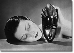
Ever since last years gorgeous foray into color, transparency and airiness, Raf Simons of Jil Sander has been something of a favorite. This season is no exception. For Spring 2009 Simons was inspired by the work of Man Ray, the 20's and African tribalism. The image that summed up these inspirations was projected on the wall before the show began.
Man Ray's "Noir et Blanche" ca. 1926 image from manraytrust.com
It was an amazing collection to see. The inspiration made itself known literally in the deep, earthy color palette and silky flapper fringe hanging in swags down the back of a mini dress or draped from shoulder to knee to make up the dress itself, which was worn over a thinly knit catsuit. But nothing veered too far into costume or historicism. Instead the fringe was used to enhance the body, hanging in such a way as to expose the curves underneath and showing every move the models made as they walked.
This being Jil Sander, there was plenty of sharp tailoring on display. The jackets were cut to the hip, boxy as per usual, but the masculinity was tempered by the fabrics, which gave some of the jackets a louche drapeyness. This season, Simon's version of the Jil Sander suit replaced drainpipe trousers with either shorts or tailored miniskirts. It had a very garcon sort of appeal, very much in the spirit of the gender bending avant garde woman that inhabited the smoky cabarets and artistic cirles of Paris in the 20's. Overall the collection exuded a sensuality that Simons has never captured before, and which is completely foreign to the Sander label. There was an eroticism in the waythe fringes parted to expose skin. More than that this was Jil Sander gone glam, summed up best in the incredible earrings that were designed in collaboration with Italian jewelers Damiani. Metal tusks speared through the earlobe with diamonds or pearls attatched to either end. Like the collection itself, they were a great blend of modernity and savagery.
Gucci
The most disastrous show of the week, as far as I'm concerned, was Gucci. It's rare at this point that I ever have anything positive to say about Frida Giannini's collections, and this season is no exception. We all know by now that we're in some hard financial times, and I'd actually be willing to give Frida some leeway if I felt that she was battening down the hatches for what will likely be a fairly safe season due to sheer necessity. But this isn't the first time that she's picked up the crumbs of trends that other designers have devoured and simply tszujed them a little bit. It's not as if you can't find the same tropical printed caftans, safari-esque cargo pieces and colorful chiffon maxi dresses at stores ranging from Zara, Topshop or H&M for the same price as the sales tax on one of the Gucci items, and to be completely honest, they're just as nice.
Besides, chiffon can only be so soft, satin so smooth and colors so rich before you have to wonder exactly what else comes with that $2,000 price tag? At least back when Tom Ford was designing and you spent a month's rent on a pencil skirt, it made your rear end look amazing and you were getting an insatiable, if imaginary, sex life with it....the attitude that skirt might give you was like a fabulous free gift with purchase.
Sadly now the only gift you get is the satisfaction of knowing that you can afford to overpay for your fashion, but is that really luxury? By now I think it's fair to say that Giannini is a one trick pony, and when the trick isn't even that impressive to begin with it's easy to lose patience. I've started wondering, would anyone really care if Gucci just abruptly stopped showing during fashion week? Would it leave a gaping hole in the fashion calendar? I have my doubts because, quite frankly, Gucci just doesn't matter like it used to.
Full blown fashion addict here, have been for years. Style is my drug of choice, and this blog is my way of spreading the high with occasional bitchiness and near constant fabulosity.


