Showing posts with label frida giannini. Show all posts

Wednesday, September 22, 2010

Crash and Burn...

Gucci

I knew it couldn't last. The restraint she showed, the optimism I felt. They were temporary, erased by the new. Logically I knew that I'd probably be feeling let down, but I still hoped I wouldn't. This is my way of saying that the Spring Summer 2011 collection that Frida Giannini presented was such a drastic departure from the positively good collection she put out last fall and which won me over, despite my distaste for the woman's prior work. With this new collection she reverted back to her former tactics faster than you can say "stiletto", and it's killing me. Watching the show, which seemed to unintentionally be broken up into three separate collections, was upsetting because after last season I've seen what Frida is capable of. She's still no Tom Ford, and she never will be, but she can do luxurious, sexy, grown up clothes that positively reek of Gucci's essence. Why she decided to shoot herself in the foot instead of going 2 for 2 is beyond my comprehension.

The collection started out with jewel tone silk separates, tapered trousers, blazers, blouses, and tulip skirts and in their clashing shades of orange, jade, purple and cerulean accented with gold accessories and red lips it would be nearly impossible not to think of Yves Saint Laurent. He was the master of these kinds of lurid mixes of color. I wish I could say that Giannini's homage did the originator justice, but instead of looking artistic, beautiful and unusual Giannini's mix of colors just looked cheap. There was zero sophistication which, mean as it sounds, is a testament to her eye for color. She may like using it but in this case anyway it wasn't used well. Ignoring the color the pieces are no great shakes with their slight 70s vibe. Compared to Marc Jacobs collection, which went there and back, it's no wonder I find these looks completely forgettable. I do like the black blouse on Natasha though. Apparently the back was cut out.


The next section, which was significantly larger, was done in shades of beige, tan and black and had a vague "safari" flavor. You know what that means, harem pants, neat jackets in exotic skins detailed with lots of junk like tassels, fringe, and braiding, and a bit of ethnic beading to finish things off. Again this section recalled Yves Saint Laurent, though an entirely different side of his work. If the opening looks harked back to his vibrant disco days then this section was pure, unadulterated, mid-60s Saharienne with just a hint of Marrakesh thrown in to cover all the bases. It's a look that's been done countless times, and honestly Frida isn't adding anything remotely new to the theme. Save for the overload of details this was textbook fashion, the kind of ready-made go-to inspiration that designers latch on to like flies to a zebra carcass. While this was the largest section of the collection it was also the most uneven. There were some beautiful pieces, but between the over-styling and the over-embellishing that went on they got a little lost in the shuffle.


The third and final section was, unsurprisingly, eveningwear and for evening Frida referenced yet another moment in Saint Laurent's career, his African collection of 67/68, in all it's tribal beaded, feathered and fringed glory. After sending out three black jumpsuits with gold detailing that, were it not for the extremely dropped crotches would have been kind of pretty, Giannini sent out what were no doubt meant to be her "drama" pieces, the ones that end a show with a bang. It's unfortunate that, for me at least, the obvious work that went into making them is overshadowed by the fact that they are both overdone and unflattering. Watching the live stream, with the size 0 and 2 models walking down the runway in their fringed, beaded, and feathered dresses, hands thrust into side pockets, I couldn't help but think of how insane it is to make a dress that is already wide around the hips appear even wider by adding pockets. Frida's a woman, and if a woman is making dresses that look kind of bulky on a too-thin model (forget about a woman who actually has a waist and hips) there is seriously something wrong.


Besides feeling like a completely unfocused collection it also feels like a giant step backwards for Giannini. I've always felt that she has relied way too heavily on special effects and not enough on the basics of designing clothes such as cut, shape and fit. There are times when it feels as though she's thinking of the embellishments first and simply applying them to whatever garment will accommodate them, and there are others when it seems like she thinks she needs to work a piece to the nth degree for it to be luxurious or special. I don't understand why she'd revert back to this comfort zone after showing that she can in fact restrain herself and produce results that are better looking than when she goes for the glue gun. I also can't help but criticize the lack of continuity in this collection. Style.com namechecked Guy Bourdin and Chris von Wangenheim as two sources of inspiration, and while I could maybe grant that the bold colors that opened the show have a vaguely Bourdin kind of feel (and I do mean vaguely) I don't see much of Wangenheim's twisted sexuality here. I also don't see how photographers who helped define the look of the mid-to-late 70s relate to Marrakesh, safari or tribalism via YSL. Fact is those references come from an entirely different decade than Bourdin and Wangenheim. There's no real connection between them and Frida didn't succeed at creating one, which is why this one collection of 44 looks is broken up so jaggedly. There's no flow from those colored disco silks to the beige harem pants and leather jackets that came next, just like there's no flow from the desert tinged safari section to the glitzed up sub-Saharan tribalism that closed the show. Weird thing is I don't all out hate this collection. It's certainly not the worst that Giannini has done and some of the pieces, like those black jumpsuits which are really the only pieces that successfully merge all of the references, are kind of nice. But I can't say that I think the collection is very good. It's not. Like I said, I knew that last season would turn out to be a fluke, I really did, but I still hoped that it might be the start of a new chapter at Gucci. It was nice while it lasted I guess.

all images from style.com

Monday, September 13, 2010

Guilt trip...


It's been a few months now since Gucci first announced the launch of their newest feminine fragrance, Guilty. My reaction to the news was ambivalence. Gucci has been churning out fragrances a lot more quickly than they used to, and while that doesn't automatically mean the products aren't good it does make you question whether or not enough time and care has been given to the new scent. It hasn't helped that the promotion for these new fragrances has seemed like too much, especially once you get to smell them. To be frank there isn't one of their newer releases that I really love all that much, although if you forced me to pick a favorite I'd probably go with Gucci by Gucci Eau de Parfum, and that's only because as a scent it's closest to the kind of stuff I gravitate towards. The appeal certainly doesn't have anything to do with the kitschtastic bottle it comes in, with it's engraved striped ribbon and chintzy horsebit charm. The other fragrances which have been directed by Frida Gianinni, Gucci by Gucci Pour Homme, Flora, and Gucci by Gucci Pour Homme Sport, strike me as utterly generic, to put it kindly. Not to beat a dead horse, but as with the rest of the brand Gucci's fragrances aren't what they used to be.

But enough back story. Despite my ambivalence towards yet another new release, the name of this new fragrance caught my attention. It definitely fits in nicely with Gucci's two most well known perfumes, Envy and Rush. All of them have names that connote a sense of danger and sin, and really what could be more old-school Gucci than that? I'm undecided as to whether or not I would have called this new one Guilt instead of Guilty, and I definitely would have called it Guilty by Gucci instead of Gucci Guilty, but sadly no one over at double-G headquarters asked for my input. Still, I think the name itself is good. Also good is the print campaign. The first shot that debuted with the announcement of the launch was, to quote Marisa Tomei, dead-on balls-accurate. In it actress Evan Rachel Wood, who I think is an unusual but interesting choice of spokesperson, kind of looked like iconic Gucci girl Georgina Grenville...at least to me. Who knows, maybe I'm just projecting. Maybe the familiar sight of a couple in a naked, sweaty, mid-coital embrace against a shadowy background looked enough like something out of Tom Ford's old play book that I was just visualizing Georgina's face on Evan Rachel's neck. Needless to say it's my favorite out of all the Giannini-directed Gucci fragrance campaigns for reasons that should be obvious.


(Tell me I'm imagining the similarities... )

However my love for the campaign ends with the photos. The TV commercial directed by Sin City creator Frank Miller might as well be another campaign entirely, because from where I'm sitting the look and feel of it is completely different from the still photographs. I don't think that Miller's neo-noir aesthetic suits Gucci very well. His aesthetic looks great in comics and in action films, but let's be honest, his work is designed to appeal mainly to heterosexual men, and this commercial is no exception. On top of that I find the blatant depiction of sex both trashy and banal (and again, something that would mostly appeal to men). While Gucci has always been about sex, it was never used so tactlessly. I find the print ad sexier simply because something is left to the imagination. That single photo is doing a better job at telling you what Guilty is supposed to evoke than the minute-long commercial is.


As for the fragrance itself, it's billed as a floral oriental with notes of mandarin, pink pepper, lilac, geranium, peach, amber and patchouli. Although I was determined to give it a sniff when it hit store shelves it sounds a little light weight for a perfume described as any breed of oriental. But when I saw that gleaming gold bottle (which has grown on me a bit since I first saw a picture of it) perched on it's display pedestal at Bloomingdales' fragrance counter I hightailed it over, made sure the SA was busy with someone else and liberally sprayed a blotter. At first I found it pretty, though as the notes implied, kind of light. I didn't remember there being anything heady or exotic about it whatsoever. So I forgot about it and left it to sit in my car. A day later when I accidentally found the blotter I had forgotten all about sitting in my cup holder I took a sniff and liked it a hell of a lot better than I had when it was fresh. Instead of the flowers and mandarin from the top what was left was a combo of patchouli, amber and something else that may or may not have been the remainder of the peach. I have a recently sprayed blotter in my hands as we speak and smelling it now over two week later it's more potent than I remembered it being, the florals are more pronounced and a bit powdery, though I still don't get much, if any, spice. Maybe I've just huffed my mother's vintage Opium one too many times and my nose has become jaded. Personally I could have gone for some incense or heavier spice or even a bit of musk somewhere in there. Frankly the drydown, which is nice, is the only thing that makes Guilty worth wearing, though I will say, considering the multitude of sugar bombs currently residing on the shelves at Sephora Guilty should provide a nice antidote for those who don't want to smell like a candy store. As for whether or not the name fits the scent, I'm not convinced that it does. To me the name suggests a hint of something corrupt or dirty, even if it's only fleeting. After all, guilt is the result of doing something that you know you shouldn't have done, or doing something that you've been told is wrong to do. Even if you repent the fact remains that you still did it. I wish Guilty had that implied hint of badness; it could have been really good if it did.

images from nstperfume.com, wwd.com, and mes-parfums.com

Wednesday, July 21, 2010

Hate is a strong word...

But sometimes it's the only word that seems appropriate. When the first image from the new Gucci Fall Winter 2010 campaign hit the Fashion Spot, I was excited to see what it would look like. The collection itself left a good impression on me, so naturally I was hoping the campaign would do the same. Let's just say that my initial impression of it wasn't so good. But I was willing to hold off announcing my verdict until I saw more. Unfortunately seeing more didn't change my feelings at all, and I pretty much hate what I've seen of the campaign. Now frankly, I don't think that Mert & Marcus' style suits Gucci. Their work is always recognizable for it's hyper-fection (I know that's not a word, but give it time), and I think that their super exaggerated look has it's place in fashion, Gucci just isn't it. But these photos go beyond exaggeration; they're downright cartoony looking. Seriously, I look at them and I see a digital illustration, not a photograph. I'm assuming that's the point, but I honestly cannot stand the way it looks. The plastic Barbie and Ken doll quality is just extremely unappealing. It's also kind of odd considering that most of Gucci's appeal is based on the suggestion of sex. As far as I'm aware there isn't anything sexy about a Barbie doll. The poses are unappealing as well, and despite what seems like a lot of effort on Raquel's part, I don't see anything "fierce" about them. To me they just look ridiculous and far too modely. Back in the day you never would have seen a Gucci girl hamming it up like some contestant on America's Next Top Model, trying to out-pose the competition. She was far too cool for that. Apparently that's not the case anymore, and that also goes back to Mert & Marcus. Love 'em or hate 'em those poses are very much a part of Mert & Marcus' ouvre. Something about the color palette is bothering me too. Rather than enhancing the warm tones of the clothes, the goldness of the sand is just sort of washing everything out. It's just one big blur of different shades of beige paired with a shade of blue that's better suited to the ocean thanthe sky. Color wise I think the shots with black clothing are marginally better, although that's not saying much. But I think I might be able to look past the aesthetics if these ads had anything at all to do with the look and the message that both the men's and women's collection delivered. Both collections were slick, sharp and very polished looking, they wouldn't be out of place on the streets of any metropolis or in a dimly lit nook at the chicest of nightspots. However, the clothes do look completely out of place in a desert. I mean, I don't demand utter realism from my fashion ads, but the sight of a fur coat or velvet hiphuggers in a desert with the blazing sun glaring off of every surface is a little too ridiculous.


Oddly enough this isn't the first time a Gucci campaign has taken place in a desert. It's happened at least twice before that I can recall, and one of those campaigns, Fall Winter 2000 by Alexei Hay, seems to have inspired this one. There was even a shot of a model in a fur coat reclining on a desert rock (for the record I believe all of the backgrounds used in that campaign were fake/digital). I actually happen to like that old campaign quite a bit. I've been trying to figure out why I like that one and dislike this one, and I suppose it boils down to two things; while the backgrounds in that F/W 2000 campaign look intentionally fake the models themselves don't, and the incongruity of the backgrounds (there were also shots that took place in front of a freeway overpass and on a stormy beach) seemed intentionally weird, whereas this background in the Moroccan desert probably wasn't meant to be as incongruous as it is. Those ads didn't make sense, and I get the feeling they weren't supposed to. They were just supposed to be beautiful, unusual images, and that's exactly what they are. I don't think this new campaign has either of those qualities going for it. More than anything I'm just disappointed that this collection, easily Giannini's best and probably just a fluke, wasn't better represented in print. It deserved to be.

images from oystermag.com, stylelist.com and twitter/rushes via ThiagoMello at tFS

Saturday, May 15, 2010

Everyone and their mother...

That's who's been wearing the debut items from Gucci's new made-to-measure line, Gucci Première. Seriously, Cannes is only into it's fourth day and so far no less than five different women (not including Frida Giannini herself) have walked the red carpet wearing pieces from Gucci's couture line, some more than once. Now when I first read about this line about two months ago on WWD I nearly choked on my own tongue. All I could think of was the amount of bells and whistles a Gucci couture gown would be covered in, given some of the recent runway collections. Oh sure, I praised the F/W 10 show because I thought it was good, but that doesn't mean I have complete faith that Frida won't lose control and relapse into her sequin abuse problem if she's left unsupervised for too long. At the time the news leaked Gucci had no comment, and I forgot all about it...until this week when the steps at Cannes were swarmed by starlets wearing Gucci. Now the impression I get from what's been written about it, and what I've seen so far, is that it's sort of Gucci's answer to Armani's Prive collection, although if memory serves Armani's collection is permitted to be called haute couture by the Chambre Syndicale, which would mean that his clothes meet the standards of true couture. Gucci isn't promoting this as haute couture, but more as a made to measure custom service for red carpet types and rich people who want something exclusive. But custom made red carpet pieces are nothing new for Gucci, they've been doing them since Tom Ford was still at the helm, so I don't really know why they're launching this as a completely separate collection.


The first woman was, somewhat fittingly given her marital status to Mr. Gucci Group himself, Salma Hayek. Now I'll say right up front that I think this is a pretty dress, and I like that the sparkle is kept to a minimum and restricted to two specific locations. It's a little bit more interesting than all over beading. But I'd be lying if I said I wasn't beyond sick of the one-shouldered thing. It's become such a ubiquitous look for red carpet events at this point. I also think that this particular specimen would have been better without that little drape falling on the arm. So yeah, it's pretty dress, but it's not all that remarkable and it certainly isn't something unique. Also, it must be said that I'm a little peevish in general about gowns with rear zippers. The only reason to put a zipper up the back is if you absolutely don't have the option of putting it on the side. I can't really tell how this dress is constructed from pictures, so I'll let it slide, but it's a little annoying because you can see the little bubble in the back where the end of the zipper is, and that's precisely why I hate rear zips. But still, Salma looks beautiful in it, and I suppose that's the most important thing.


Next up was Camille Belle in a navy column, also one shouldered and also featuring strategically placed beading. The dress is fine I guess, although the only thing that made me look twice was the way the beading sort of dissolves down the back, which is a beautiful effect. But everything else about this look is both bland and kind of mature. The dress itself, from the color to the cut, seems destined for an older woman, probably in the over 35 age range, if not older. There's something almost conservative about it, despite the bit of sparkle and the slit up the leg. The hair and makeup really isn't helping matters as it makes Belle look about 15 years older than she is. But most of all this dress just looks like something you'd find in any number of department stores or dress shops. It's a standard evening wear template, not something you can go wrong with, but not something that's going to turn heads either.


The dress Kate Beckinsale wore was, at least, somewhat interesting to look at...although I don't really like it. There's something about the mix of the very dense silver beading and the sort of ethereal look of the draped shoulders and flowing train that doesn't quite work. I don't think the armor like panels really work well against the soft, romantic silhouette and delicate beading in the drapery at the hips. I dunno, it just doesn't work for me. From the back it gets worse, because in addition to the weird clash of hard and soft, the sewing in the rear seam is a little fucked up, to put it plainly. It's the kind of thing any fashion design professor would teach you how to avoid. That puckering, and especially right on the ass, is not pretty. I don't know if it's because the fabric has lycra in it, or if the dress wasn't properly altered, or if it was just poorly sewn, but it's shoddy looking and that's a shame, especially with Gucci promoting these looks as the most exclusive of all of their products.


Camille Belle also showed up to an event wearing a short, fitted, off the shoulder dress completely beaded in a degrade pattern. The dress is boring as hell, but it's cute and sparkly and a hell of a lot more youthful than the other dress she wore. But it's been almost 3 years since every young actress and "personality" in Hollywood has had their stylist slather them in Crisco so they could slip into an Herve Leger bandage dress, which is exactly what this looks like, and I'm completely burnt out on that look. More than anything I just like the effect that was achieved with the beading. Also wearing a short, sparkly number was Giannini herself, making the rounds of events along with her coterie of clients. Her dress is another that I've seen a million of, from runways to department store racks. It's nothing I'm about to piddle over.


The dress that French actress Lea Seydoux wore was by far one of the most interesting dresses of the ones I've seen. It's also one of my least favorites. There's just something about it that rubs me the wrong way. I wish I could offer an explanation as to why, but I have no effing clue. I will say this though, at the very least it's not a predictable red carpet choice (I don't even know when I last saw a cap sleeve) so that's a positive. But other than that I think I might actually hate it.


Naomi Watts has the distinction of wearing my favorite dress out of the ones that have been seen so far, which isn't saying much, but it's something. I love the angular pattern that basically makes up the entire dress. Despite how blah a pale beige strapless column gown is by it's very nature, there's at least something really graphic to look at with this one. I would have loved to see this in a darker, more severe color, something to play up the sharpness of those pleats. I for one am completely over the pale flesh-tone thing that so many women seem to gravitate towards for the red carpet. At the very least if you're going to go for a neutral color, go for black. It doesn't have that aura of "meh" to it. Still, it's a pretty dress, although I'm a little concerned about the workmanship. It looks a little rough on the bust.

And lastly there was Mrs. Gucci Group again, although I have to say I detest this dress. There's something cheap about it that I can't quite pinpoint, but the two things that come to mind when I look at it are: department store evening dress on the 50% off rack at Lohmann's, or some novice fashion student's attempt at making a "Versace" gown. I doubt if that's the kind of association Gucci want's anyone to have while looking at any of their products, least of all a custom made dress for the wife of their CEO.

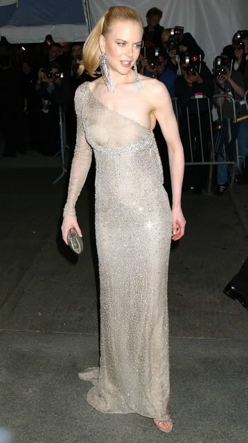
Now, I'm fine with Gucci wanting to up their exclusivity factor by creating one-off pieces for celebs. They're not the first and they probably won't be the last. But here's the thing, if you set out to create a line that promises exclusivity, you better make damn sure that the product makes good on it. None of these dresses are the kind that would really pop on any red carpet, and I truly think that were it not for the fact that Gucci was promoting the line at one of the biggest red carpet events of the year, nobody would look twice at any of them. I also find it hard to believe that a paying client would want a custom made dress that was so indistinct. No, ultimately the label in a dress isn't important if the dress is beautiful, but you wouldn't go to Chanel to have a suit made for you that looks like any other suit, so why would you want a Gucci gown that looks like any other gown? I'll be honest, even when I've hated them Frida's evening gowns and party dresses have usually had some personality to them. Take the dresses she did for fall, there's no way those would blend in on a red carpet. Even though a casual observer might not know right away that they're Gucci, they would no doubt assume that they're high fashion. These dresses however could be by any second rate red carpet designer. It's kind of ironic that the dresses which will be produced in quantity look more exclusive and unique than the ones that are one of a kind. And I know I'm guilty of bringing every Gucci related post back to Tom Ford in some way, but I can't help pointing out that his custom designed pieces while he was at Gucci and YSL got people's attention and stood out at an event. For proof look no further than the one-sleeved nude column covered with clear crystals that Nicole Kidman wore to the 2003 Met Gala. Seven years later and nude beaded gowns are a dime a dozen, but that trend can probably be traced back to that one Gucci dress. Simply put it had the wow factor that none of these new designs possess, but it wasn't some completely out there design. I guess in the end high impact dressing doesn't need to be ridiculous, it just needs to be well calculated. If these new looks are an accurate representation of what the Gucci Première line is going to be about then to be honest I just don't see the point.

all images from daylife.com, zimbio.com and getty.com thanks to Flashbang at The Fashion Spot

Sunday, February 28, 2010

About face...


Gucci


For me to say that I'm not Frida Giannini's biggest fan is something of an understatement. Anyone who has read either my blog or my posts on the Fashion Spot (which date back to the dawn of her career) can tell you without a doubt that I haven't always been kind to our girl Frida. So imagine my complete and utter disbelief to find that this season I was kinda impressed by her collection. That's right, I said impressed, so bear with me.

My issue with Giannini is three-fold; from the beginning she completely ignored the well established identity and aesthetic of the house, in her zeal to erase the memory of her iconic predecessor her collections were erratic and lacking in any kind of consistency, and the simple-minded trends/cliches she worked with gave the impression that her clothes were nothing more than luxed-up fast fashion. On top of those things her most recent collections have been too reliant on special effects rather than good design. By that I mean she spent too much time decorating basic pieces that, despite their astronomical price-tags and overt displays of "luxury", didn't actually seem all that luxurious. All in all her collections have been, to me at least, too self conscious, like after four years she still doesn't have the confidence needed to put her own permanent stamp on the Gucci legacy. Well apparently we may all be in for a change.

Giannini's collection for Fall Winter 2010 is hands down the best she has done in her eight-season tenure at the house. Gone are the gimmicks, the overwrought details, and the frivolous, youth-obsessed, flash in the pan trends. In their place are beautiful, sexy, timeless looking clothes for beautiful, sexy, confident women, not girls, women. Everything about this collection, from the rich palette of warm neutrals in contrasting shades, to the longer skirt lengths, and even the non-tricked-out accessories seem geared towards a more grown up clientele who doesn't need to flaunt their fashion cred. And unlike in past seasons this collection placed more emphasis on daywear, with sharp tailoring a focal point as opposed to flirty day dresses and party gear. Most of the day looks were built around this season's pant; narrow, low on the waist but not ridiculously so, and flared just enough to spill over the foot. In the past Giannini's pants, with their low waist, tapered leg and overall boyish look really didn't appeal to me, so it was nice to see her working on a new shape, especially one that's really flattering. With the pants she paired understated coats or furs that were luxe without being obnoxious and simple silk camisoles or blouses. As an entire look the pants, slightly oversized coats and silk button downs worn partially open definitely recalled Tom Ford's very first Gucci collection as creative director back in 1995, not that that's a bad thing. Mixed in with the pant looks were some sheaths with slashes along a bias seam held closed with polished gold hardware. Those few looks brought to mind the white jersey gowns with gold hardware that Ford showed in his iconic F/W 1996 collection which, again, isn't a bad thing. There were also a few looser draped dresses in smudgey prints or solid black before the collection moved into evening.


Let's face it, evening has always been a big deal at Gucci and it probably always will. In my opinion eveningwear has never been Giannini's strong suit, she's always showed a bit more skill with sportswear and casual dresses. But this time around, though I didn't love every look she sent out for after dark, I liked that the looks were more mature, more hedonistic and more "Gucci" than anything she's shown before. Most of the looks mixed python patterned lace or mesh with paillettes and ostrich feathers on the sleeves. Paired with coordinating patterned lace tights and metallic python sandals it was a lot of look, but because all of them were cut above the knee they avoided that sharp left into tacky territory. Sure, not all of them worked but the looks that did were really beautiful, and kind of unusual too in their mix of textures. A black one with a plunging v-neck held up by a metal collar worn with a bolero in ombré feathers had a beautiful degrade effect going on, from the opaque paillettes at the top down to the sheer tights on bare flesh at the bottom. The look reminded me, though very vaguely, of the beaded dresses and marabou boleros Tom did back in '04. Another, a cognac long sleeved dress with copper paillettes fading from top to bottom was also really beautiful. The best thing about these looks is that they're a more extreme, grown up take on glamour than what Giannini is known for. You're not likely to see some unkempt hipper-than-thou wild child pulling these looks off, that's for sure.


I think that this collection is completely refreshing coming from Giannini. It's not relying on anything but quality clothing and good styling, which is what made Gucci a powerhouse to begin with. It takes a bit of maturity to hold back and let the clothes be the focal point instead of a theme or overdone details. Are these clothes anything new? No. Are they bound to shake fashion to it's core? Probably not. But that's okay. I am still pretty shocked by how much I like this, although I'm starting to think that maybe I shouldn't be. The fact is that a lot of this bares a resemblance to Tom Ford's work at the house, especially in his disco-loving early days. Looking at this I'm left wondering why Frida spent so many seasons trying in earnest to avoid the territory he mapped out, because while this doesn't have the same heady punch of Ford's work, it fits his Gucci blueprint very well. This woman seems to be the softer, less depraved sister of Ford's femme fatale. She may not have that same predatory sensuality that leaves a path of broken men in her wake, but I bet she's got a few of her own tricks up her ostrich feather sleeve. Here's hoping we'll get to see them.

all images from Style.com

Thursday, July 30, 2009

The not-so-glamorous life...

So even though I completely railed on the Gucci F/W collection (and I stand by that review) I admit that I was looking forward to seeing the ad campaign for it, which mainly had to do with the casting. The female models include Raquel Zimmermann, Anja Rubik, Abbey Lee, perennial Gucci droid Natasha Poly, Myf Shepherd (couldn't pick her out of a lineup if my life depended on it), Ernest Hemingway great-granddaughter Dree Hemingway, Freja Beha, vintage Gucci Girl Jacquetta Wheeler, and unexpected curve-ball Jamie Bochert. Now, in my opinion Frida Giannini's taste in models skews pretty bland for the most part, not to mention almost exclusively white (no change there, unfortunately), so I was thrilled to hear that this collection would break the cookie cutter Gucci mold of late with seasoned Gucci veteran Jacquetta and quirky underground fave Jamie. And I'll admit that even though the clothes shown on the runway were beyond tacky, they at least make for lots of visual interest, as well as having a built-in nightclubby vibe to them. So needless to say I was expecting something really fun, really glam, and maybe even a little sexy or edgy...not unlike the F/W 06 campaign shot by Craig McDean. My expectations were high, higher than they've ever been for something that Giannini's had a hand in doing, and I was eagerly awaiting the finished result. The result, however, was so anticlimactic that I now find myself wondering why I was ever interested in seeing this campaign to begin with. Like I said in my post about the Givenchy campaign, I'm not an Inez & Vinoodh fan. Their appeal usually eludes me. I don't really get a distinct point of view from them, and more often than not I find the results of their work completely unimpressive. In fact the only times I can think of where I've liked their work was their Balenciaga campaigns from the early 00s, and the one Gucci campaign they did with Tom Ford back in 2001. Other than that, nothing, and this campaign has done nothing to change that. What all of the glitter, glitz, camp and trashiness of the runway amounted to was a white backdrop with black platforms and an overcrowded group of models striking random "unposed" poses while never interacting with each other. That's one thing I can't stand, intentionally random stuff that looks like it was meticulously planned. I'm fine with meticulously planned perfection, and I'm fine with meticulously planned randomness that looks effortless, but I HATE meticulously planned randomness that looks rehearsed, and this does. Plus, could the concept be more boring? If you're going to latch on to a cliche, and at this point that's exactly what the whole 80s nightclub thing is, then ride it 'til the very end. In all honesty, with less models this would make a decent enough editorial concentrating on graphic clothes or something like that, but as an ad campaign? How does this really differ from the mind-numbingly boring studio shoots that Anna Wintour is repeatedly lambasted for doing at Vogue? This is just as boring as far as I'm concerned.


After seeing three of the final shots already, I have a pretty good feeling that this won't get much better than it is now, though I'd be thrilled if I turn out to be wrong about that. Oh I'm sure that there will be at least one good shot among the lot of them, but I doubt if it'll be anything worth remembering. In a strange way I can't even fully blame Frida for this campaign. Yes, she had final say in everything, but that F/W 06 McDean campaign was worlds better than this, and I believe she had final say in that as well. I don't even think I'd care as much if it wasn't for the fact that Frida, I&V and both of their creative teams responsible for creating this campaign from start to finish had all of the right ingredients at their disposal; a decent mix of models, visually impactful clothes and accessories, and a fun theme to work with as well. What made them decide to go for the most basic possible result will probably remain a mystery, and one that I'm not even all that interested in figuring out. Consider the lesson learned; never, EVER get your hopes up where Gucci is involved. It's pointless.


images from vogue.co.au and NothernStar @ tFS